| Author | Thread |
|
|
03/15/2003 11:33:27 AM |
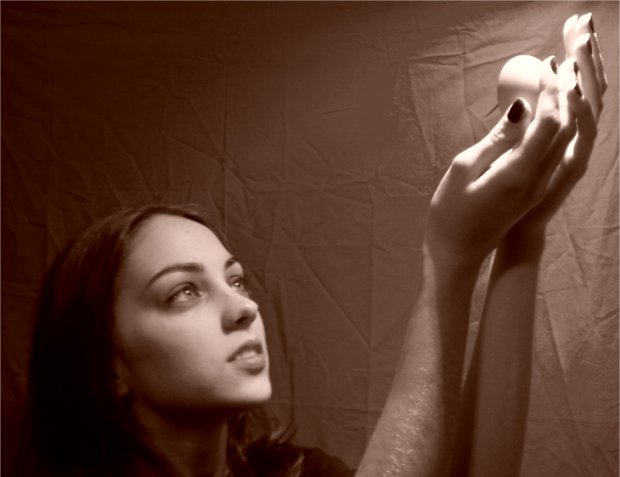
I like the sephia tone. Nice job.
Message edited by HBunch - Crituque Club Status Removed. |
|
Comments Made During the Challenge  |
|
|
03/08/2003 02:00:07 PM |
| Fun idea that works for me. Lighting is great. Quite out of focus, however, though I can see an argument for a "soft focus." This doesn't appear to have "soft focus" however, it just looks blurry. |
|
|
|
03/07/2003 01:41:35 PM |
| the wrinkles in the backdrop are really distracting, use an iron. |
|
|
|
03/06/2003 11:40:32 AM |
| It is a bit out of focus and wrinkled sheets as a background drive me nuts! :). Nice subject and framing. |
|
|
|
03/05/2003 09:21:23 PM |
| The model's eyes are great. Looks like a goddess. I like the concept alot. Everything works for me, but the background. This girl must be very tall, she has very long fingers - longer than mine and i'm 6'6". Very beautiful girl too! |
|
|
|
03/05/2003 12:44:39 PM |
| Not bad but all those wrinkles in the back drop sheet are very distracting |
|
|
|
03/05/2003 01:53:05 AM |
| LOL. The focus is a little off I think. Interesting idea. :) |
|
|
|
03/05/2003 01:24:52 AM |
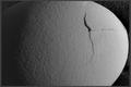
| amusing idea. the sepia tones and te tight focus of the light on the egg was a great idea. I personally didn't like the soft focus on the egg which brought down my score here. |
|
|
|
03/04/2003 08:22:05 PM |
| to soft on the focus, the positioning and lighting are great but were is the focus at the moent it is on the sheet in the backgroung |
|
|
|
03/04/2003 01:44:09 PM |
| good idea and nice job with the lighting, the image could have been a little more clear though |
|
|
|
03/04/2003 10:06:44 AM |
| iron the sheet, it detracts - or maybe an all bacl background? |
|
|
|
03/04/2003 02:20:19 AM |
| Good idea, but it didn't work out quite as good as it could have. Is this how you visualized it, or did you have something else in mind? |
|
|
|
03/03/2003 06:56:34 PM |
| I really like the softness of this image and the lighting is great also... the wrinkled background is a bit distracting though.. this shot has great potential :) - setzler |
|
|
|
03/03/2003 06:44:43 PM |
OK. gonna shoot you down for this one (hopefully the comments will be useful though).
1. Out of Focus.. Mayeb you tried to opt for the "soft focus" look, but doesnt work for me.
2. The background, the creases REALLY need to be sorted out, far too distracting..
3. The photo is somewhat "cliche" and very pretentious, which isnt always a bad thing, but overall this leaves me cold..
Nice colours though.. 6 Marksimms |
|
|
|
03/03/2003 04:56:11 PM |
| a bit out of focus but a real nice shot and original |
|
|
|
03/03/2003 01:22:09 PM |
| I was going to ake a similar picture, and going to tile it Contempalting an egg |
|
|
|
03/03/2003 12:11:16 AM |
| This is a really nice example of light. This photo might be improved if you ironed the wrinkles out of that background before you took the picture. also, the focus seems a bit too soft.if you had a low depth of field and had her face and hands in focus it would probably also knowck those wrinkles out. |
|
Home -
Challenges -
Community -
League -
Photos -
Cameras -
Lenses -
Learn -
Help -
Terms of Use -
Privacy -
Top ^
DPChallenge, and website content and design, Copyright © 2001-2025 Challenging Technologies, LLC.
All digital photo copyrights belong to the photographers and may not be used without permission.
Current Server Time: 03/12/2025 10:28:40 PM EDT.