| Author | Thread |
Comments Made During the Challenge  |
|
|
01/31/2005 10:40:22 PM |
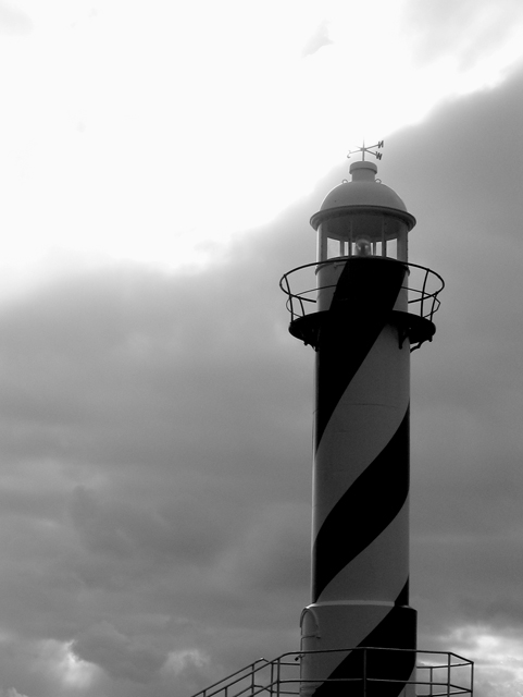
| Composition is great and tones/use of B&W a good choice. Blown-out section on top (white) really hurts this image in my opinon. ((5)) |
|
 Photographer found comment helpful. Photographer found comment helpful. |
|
|
01/31/2005 12:35:18 PM |
| I like the repeating diagonal elements. |
|
| Photographer found comment helpful. |
|
|
01/27/2005 06:15:33 PM |
| This doesn't pop for me- the tones feel flat. Interesting sky though. |
|
| Photographer found comment helpful. |
|
|
01/24/2005 05:41:46 AM |
| while i appreciate you effort here, i think your image could use some work. the bottom half is nice and tight, but the top is completely blown out. if it is on purpose, i'll admit, i'm not getting it. if this is not intentional, then please don't take it personally if you are not getting the scores and comments you expected. this is a tough challenge, especially in its size, and to do well, you need to connect with the viewers both technically and aesthetically. good luck! |
|
| Photographer found comment helpful. |
|
|
01/24/2005 03:07:53 AM |
| Nice composition and subject - that sky is just way too blown out though, its a real shame. |
|
|
|
01/22/2005 05:50:50 AM |
| I think this photo may suffer a bit from people with smaller moniters. I find it to be unnecessarily to tall and a 1 inch crop off the top would have had the same impact. I like the B&W style and the way the contrast from the sun whites out the weather vain on the top. It also has excellent clarity and good use of ROT. Well done and keep up the good work in 2005. |
|
| Photographer found comment helpful. |
|
|
01/21/2005 03:14:44 PM |
| its a good picture, the overblow sky though is too much of a contrast against an otherwise dark shot |
|
| Photographer found comment helpful. |
|
|
01/20/2005 07:54:31 PM |
| would have been better showing the base, but I assume you cropped it out for a reason |
|
| Photographer found comment helpful. |
|
|
01/19/2005 04:31:46 PM |
| Don't know if it's just me, but it looks like something spooky looking down from the top of the lighthouse. |
|
|
|
01/17/2005 02:41:59 AM |
| Nice simple composition. I you could have made the clouds look a little more dramatic (burning). Intriguing shot. |
|
| Photographer found comment helpful. |
|
|
01/16/2005 09:18:42 AM |
|
| Photographer found comment helpful. |
|
|
01/16/2005 12:17:10 AM |
| I LOVE lighthouses! This is a great shot of one, I wish the top of the weather...thing were'nt washed out though. |
|
| Photographer found comment helpful. |
Home -
Challenges -
Community -
League -
Photos -
Cameras -
Lenses -
Learn -
Help -
Terms of Use -
Privacy -
Top ^
DPChallenge, and website content and design, Copyright © 2001-2025 Challenging Technologies, LLC.
All digital photo copyrights belong to the photographers and may not be used without permission.
Current Server Time: 03/14/2025 11:48:18 AM EDT.