| Author | Thread |
|
|
01/19/2005 08:21:12 PM |
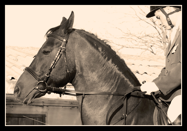
| Yours is one of a few photos that should have finished higher than what it did. I really don't see how some photos made it in the top 40 ! I have to wonder about our voters sometimes !! |
|
Comments Made During the Challenge  |
|
|
01/18/2005 11:39:01 PM |
| Absolutely perfect for this challenge. Beautiful detail on the horse. I love the way you played down the rest of the photo. 10. |
|
|
|
01/18/2005 09:54:40 PM |
| Great job with the toning, makes it look old. I might like to see the border toned down a little, but it's not really enough to detract from the shot 10 |
|
|
|
01/18/2005 03:57:25 PM |
| Looks really aged. Doesn't fit the challenge that well (Movie Titles, not movies), but many pictures don't. Nice crop. 7. |
|
|
|
01/18/2005 03:18:47 PM |
| I think this is more a picture denotes a scene from the movie. Nothing wrong with that in itslef, but if you hadn't seen the movie, you wouldn't know the relevance of the photo. However I like the crop. I find the border a little "heavy". Good luck |
|
|
|
01/17/2005 08:54:03 PM |
| I like the tones you have used here , fits the era which was late 30's. Could pass as an old postcard ! What a movie and what a horse ! Well done ! |
|
 Photographer found comment helpful. Photographer found comment helpful. |
|
|
01/15/2005 10:56:24 PM |
| I thought it was george the horse |
|
|
|
01/14/2005 12:42:52 PM |
| teh border is a bit too much. some areas blown out (hands, leg of rider, sky) part of that might be on purpose so to speak but the parts of the rider are distracitng/drawing my eye. nice and sharp. |
|
| Photographer found comment helpful. |
|
|
01/13/2005 09:06:23 PM |
| Sepia works very well giving a nice old feel to this shot. Blown out in a couple spots, but dosn't hurt it that much. Fits your movie theme well. Great job. |
|
| Photographer found comment helpful. |
|
|
01/13/2005 08:02:11 PM |
| I like the crop. Emphasis is on the horse while still introducing a bit of interest with the rider. Sky is a little harsh but all in all a nice photo. The tone goes well with the era too. |
|
| Photographer found comment helpful. |
|
|
01/12/2005 03:35:37 PM |
| would like to see this without the border. |
|
Home -
Challenges -
Community -
League -
Photos -
Cameras -
Lenses -
Learn -
Help -
Terms of Use -
Privacy -
Top ^
DPChallenge, and website content and design, Copyright © 2001-2025 Challenging Technologies, LLC.
All digital photo copyrights belong to the photographers and may not be used without permission.
Current Server Time: 03/11/2025 01:52:46 PM EDT.