| Author | Thread |
Comments Made During the Challenge  |
|
|
01/31/2005 12:27:03 PM |
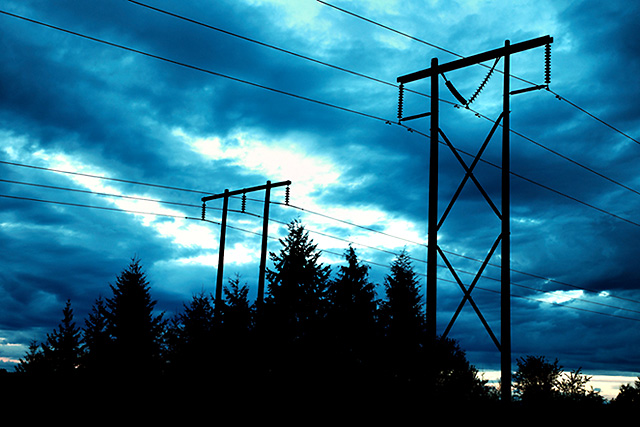
| I like it when people figure a way to use the wirea and poles instead of always trying to get rid of them. |
|
 Photographer found comment helpful. Photographer found comment helpful. |
|
|
01/23/2005 07:19:06 AM |
| this is a really wild image. these most interesting colors really bring life to what would ordinarily be a boring shot. good work here and in 2005! |
|
| Photographer found comment helpful. |
|
|
01/18/2005 07:03:13 AM |
| A clever composition, but the blueness is too much IMO. I would personally have preffered a more natural looking sky. |
|
| Photographer found comment helpful. |
|
|
01/16/2005 03:59:16 PM |
I saw in the forum that you only had one comment so far, so I was thinking: let me go and explain my score= 4, because the average was also sub-5 (I am not going to change it)
The 4 was greatly influenced by the "not very interesting"-factor. Electricity poles and lines, a bit of foliage profile, a colored sky and a very bright spot. Don't get me wrong, I see the relation of the color of the sky and the powerlines resulting in the idea "Electric Sky" and I think it was good idea. It is just that it doesn't look very interesting to me. The photo is a subject an sich, the main subject in the photo is not very clear.
The sky looks like as if the color was changed to these blue tones. It doesn't look natural. The contrast between the bright spot and the dark foliage is also very big, to the point where the brightness gets annoying. Also because the bright spot is in the middle. Somehow I also get the feeling that the poles lean backwards, especially the one on the left side.
I do like the off-centre positioning of the poles, the profile of the foliage and how the lines lead trough the frame. But this photo is on my personal voting range for this challenge just not good enough. In a normal challenge it might have been between 5 and 6 depending on the subject of the challenge.
Good luck in 2005. ;)
Here I am again. Checked your porfolio. Take "Taste Wheat" for example. I would have given that one an 8. |
|
| Photographer found comment helpful. |
|
|
01/16/2005 07:28:02 AM |
| Great colours here - perhaps a little too much of the trees in the frame but an interesting shot nonetheless. |
|
| Photographer found comment helpful. |
Home -
Challenges -
Community -
League -
Photos -
Cameras -
Lenses -
Learn -
Help -
Terms of Use -
Privacy -
Top ^
DPChallenge, and website content and design, Copyright © 2001-2025 Challenging Technologies, LLC.
All digital photo copyrights belong to the photographers and may not be used without permission.
Current Server Time: 04/10/2025 03:52:59 PM EDT.