| Author | Thread |
Comments Made During the Challenge  |
|
|
01/23/2005 09:01:10 AM |
| what an interesting image. it does take a bit of work to get into it, though. maybe if the sides were cropped off a bit, it might make it a bit more accessible. looks like it could be a target rich environment for candids, also. hope you're getting some good comments and suggestions, and this you're not getting overlooked in this monster challenge. good luck! |
|
|
|
01/22/2005 09:59:42 PM |
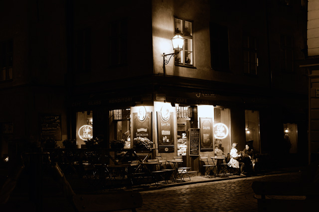
| i wish that sign was more readable, but overall nice image |
|
|
|
01/22/2005 09:45:23 PM |
| Good night scene, beats your standard city skyline, and the sepia tone works a treat. |
|
|
|
01/22/2005 12:54:17 PM |
| Parisian post-card! Very accomplished photo.....like a beacon of light in the night. |
|
|
|
01/18/2005 03:06:31 PM |
Even the barely perceptible pose of the two people outside of the cafe is just perfect. I would love to see the full size version of this...I really find the siding in the top right corner to be incredibly distracting in an otherwise soft image.
Overall, a very nice photo. |
|
|
|
01/18/2005 12:15:15 PM |
| SEEMS LIKE TIMES PAST . LIKE IT |
|
|
|
01/18/2005 03:44:44 AM |
| This evokes thoughts of old fashion black and white film photos of old cafes possibly in Paris. I love it! The street scene is really wonderful :-) I'm trying to think of a specific photographer who it reminds me of, but his name is escaping me. Anyway... very nicely done. Only suggestion I might make is to play with cropping a little more... especially maybe the left side... but I'm not sure. Good luck! |
|
|
|
01/17/2005 12:51:06 PM |
|
|
|
01/17/2005 12:30:02 PM |
| I really like this apart from a bit too much totally black areas. |
|
|
|
01/17/2005 11:25:11 AM |
| Beautiful, but maybe a little dark? |
|
|
|
01/16/2005 08:24:52 PM |
| Nice night shot, and I like the sepia treatment. I think a more square crop that included only the cafe (stopping on the left just outside of the lighted window, and on the right so as not to include the corner of the adjacent building) would have been even better. ...6... |
|
|
|
01/16/2005 04:15:00 PM |
| Wish this wasn't quite so dark. I like to see more details, esp. in the name on the awning and the people. |
|
|
|
01/16/2005 03:06:11 PM |
| I would crop this tighter to get rid of the dark on the left and the "stray" brick on the right. I love the feel of the sepia tones and the scene in general though. I'd be proud of it too - |
|
Home -
Challenges -
Community -
League -
Photos -
Cameras -
Lenses -
Learn -
Help -
Terms of Use -
Privacy -
Top ^
DPChallenge, and website content and design, Copyright © 2001-2025 Challenging Technologies, LLC.
All digital photo copyrights belong to the photographers and may not be used without permission.
Current Server Time: 04/26/2025 12:41:58 PM EDT.