| Author | Thread |
|
|
01/19/2005 11:49:02 AM |
Greetings from the Critique club!
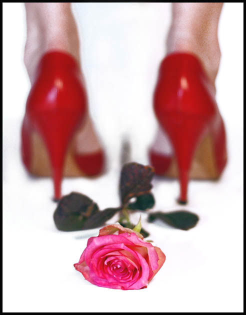
Initial impact: woa thats ok of focus... ohh ok it's for the brokeh challenge.
Does it meet the challenge: IMO no. Brokeh is an out of focus background that enhances the image. I feel and you seem to feel the same way acording to your comments, that the image would look better if the heels were in focus. I also feel that for brokeh to work effectivly you should not be able to easily identify the background image.
Focus: Theres no need to rehash on the previous comment on brokeh.I read through the comments left to you from other voters and asij mention noise in the background. While I agree that neat image would work nicely on this, I dis agree that it is noise in the image. I think that what you are seeing is the panty hose. I have shot it several times and had similar results. I have discovered however that if you would like to keep the panty hose definable then a light coat of hairspray misted over them helps. Not 100% sure why but the lighting seems to like it better. However if you want a nice dark tan, neat image works very well.
Color: I like the colors fairly well. The rose is my only complaint in the catagory. I feel that a red rose would work better than the pink symbolicly than the pink. It repressents more of a lust in my mind wich work better with the heels in my opinion. The Rose also apears to be a little old, and is begining to wilt. If this was the idea perhaps a little older rose would have done better.
Over all: I think this is an absolutly great concept. I like the feeling and impact of the shot. But I feel that the rose and brokeh did not work well with the shot. On an off track did you try putting the heels in the foreground and the rose in the background? That might have worked.. well I hope my critique had at least somthing you found usefull in it for you. Best of luck in future challlenges!!
Tristalisk |
|
 Photographer found comment helpful. Photographer found comment helpful. |
Comments Made During the Challenge  |
|
|
01/16/2005 11:54:27 AM |
| The idea is alright and the bokeh seems to be there but overall I don't care for this. It's very grainy and pixelated (could be from upload though), the pink rose clashes with the red shoes, and the rose seems to be...unhealthy; the leaves, especially, look diseased or something. |
|
| Photographer found comment helpful. |
|
|
01/14/2005 11:16:36 AM |
| That is a really nice idea and great colours. I just"personaly" think it could be alot better whitout that noise in the bokeh. You propably know about the free download at neatimage.com where you could remove it. Then the skin colour is littel bit off for me. But great idea non the less.. 7 |
|
| Photographer found comment helpful. |
|
|
01/11/2005 01:59:46 PM |
| Great picture, but I don't know how good of an example of bokeh this is....The background isn't out of focus enough for the true bokeh to emerge. Still a great shot. |
|
| Photographer found comment helpful. |
|
|
01/11/2005 03:18:39 AM |
| definitely bokeh, but not very appealing composition to my taste |
|
| Photographer found comment helpful. |
Home -
Challenges -
Community -
League -
Photos -
Cameras -
Lenses -
Learn -
Help -
Terms of Use -
Privacy -
Top ^
DPChallenge, and website content and design, Copyright © 2001-2025 Challenging Technologies, LLC.
All digital photo copyrights belong to the photographers and may not be used without permission.
Current Server Time: 03/13/2025 12:50:05 PM EDT.