| Author | Thread |
Comments Made During the Challenge  |
|
|
01/18/2005 11:25:27 PM |
| Not even comment worthy; you probably already know that you need to try harder. |
|
|
|
01/17/2005 10:38:47 PM |
|
 Photographer found comment helpful. Photographer found comment helpful. |
|
|
01/17/2005 04:37:56 PM |
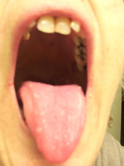
| Unsharp. I don't see the throat, but the mouth. Also (sorry for attacking your model/yourself) the black teeth aren't very nice to look at. 2. |
|
|
|
01/17/2005 01:58:25 PM |
| nice idea..composition, focus and lighting are bad |
|
| Photographer found comment helpful. |
|
|
01/17/2005 01:30:38 PM |
| This is a little too blurry. I like how the picture and the title work good together but it is blurry all over and if you maybe focused more then you would maybe have a better score. |
|
|
|
01/16/2005 10:51:05 AM |
| Would be nicer if centered, in focus, and with color adjustments. |
|
| Photographer found comment helpful. |
|
|
01/16/2005 04:45:16 AM |
|
|
|
01/15/2005 06:51:12 PM |
| Out of focus, color seems off, overall a generally unappealing photo. |
|
|
|
01/15/2005 06:13:34 PM |
| we can hardly see your throat |
|
|
|
01/15/2005 02:46:41 PM |
Actually, is more the roof of the mouth than the throat. focus is sharp in the bg over the shoulder, but is not sharp on the subject.
|
|
|
|
01/15/2005 11:03:47 AM |
| There is no focus anywhere in this picture. Also it is quite unaesthetic. In terms of subject matter, it is more like wide mouth than deep throat. |
|
|
|
01/14/2005 04:35:52 AM |
|
|
|
01/13/2005 01:07:18 PM |
| Unfortunatly this image is a little out of focus. |
|
|
|
01/13/2005 10:25:38 AM |
|
|
|
01/12/2005 06:29:12 PM |
| Yuk! I cannot think of one single redeeming factor in this picture. Out of focus, bad lighting, bad composition, bleak colors and unattractive cavity (1) |
|
|
|
01/12/2005 06:09:50 PM |
| could have worked out better. the concept is interesting (and i bet it was a spur of the moment thing :-) ) but you should have cropped out that door frame on the right, and the tongue should be in focus. |
|
| Photographer found comment helpful. |
|
|
01/12/2005 01:03:47 PM |
| look at all those fillings |
|
|
|
01/12/2005 07:25:34 AM |
|
|
|
01/12/2005 06:54:02 AM |
| Ugly and out of focus. But hey. at least it's not pornographic. :) |
|
| Photographer found comment helpful. |
|
|
01/12/2005 02:47:49 AM |
| With another title, in another context... There's no I would give you a vote as high as the one I'm giving you. You get away with it this time! lol Good job! |
|
| Photographer found comment helpful. |
|
|
01/12/2005 02:31:32 AM |
| Good idea, but I find this presentation kind of unappealing. Focus could be sharper. |
|
| Photographer found comment helpful. |
|
|
01/12/2005 12:54:07 AM |
| Focus, focus. Man even the thought of that will give me nightmares. |
|
|
|
01/12/2005 12:15:38 AM |
|
Home -
Challenges -
Community -
League -
Photos -
Cameras -
Lenses -
Learn -
Help -
Terms of Use -
Privacy -
Top ^
DPChallenge, and website content and design, Copyright © 2001-2025 Challenging Technologies, LLC.
All digital photo copyrights belong to the photographers and may not be used without permission.
Current Server Time: 04/02/2025 07:53:16 AM EDT.