| Author | Thread |
|
|
08/03/2005 10:18:22 PM |
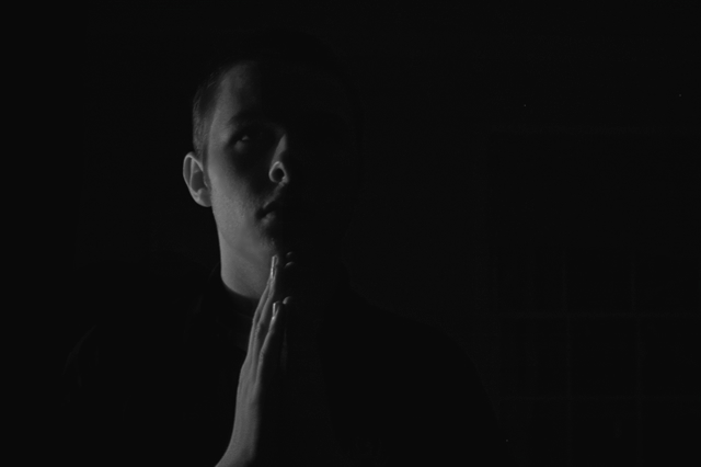
| Just a zone higher on the lighting would have given this image a better edge. Idea and pose is great. |
|
 Photographer found comment helpful. Photographer found comment helpful. |
Comments Made During the Challenge  |
|
|
01/16/2005 01:26:19 PM |
|
| Photographer found comment helpful. |
|
|
01/15/2005 01:21:30 AM |
| kind of too dark, but interesting |
|
| Photographer found comment helpful. |
|
|
01/14/2005 05:52:59 PM |
| hehe, this one is funny :)). |
|
| Photographer found comment helpful. |
|
|
01/13/2005 06:28:39 PM |
| You've got a lot of unused space on the right (the window there barely shows and doesn't do anything for the shot) and I tink you could have done a closer crop on the guy--to make it more centered. |
|
| Photographer found comment helpful. |
|
|
01/13/2005 03:55:12 PM |
| Even though shot in the dark, light should look like light, not dark gray. Highlights needed in this photo would've made it much stronger. |
|
| Photographer found comment helpful. |
|
|
01/12/2005 05:27:46 PM |
| i think more contrast between the person and the background is needed. |
|
| Photographer found comment helpful. |
|
|
01/12/2005 01:28:19 AM |
|
| Photographer found comment helpful. |
Home -
Challenges -
Community -
League -
Photos -
Cameras -
Lenses -
Learn -
Help -
Terms of Use -
Privacy -
Top ^
DPChallenge, and website content and design, Copyright © 2001-2025 Challenging Technologies, LLC.
All digital photo copyrights belong to the photographers and may not be used without permission.
Current Server Time: 04/27/2025 05:11:30 AM EDT.