| Author | Thread |
Comments Made During the Challenge  |
|
|
01/23/2005 07:38:24 PM |
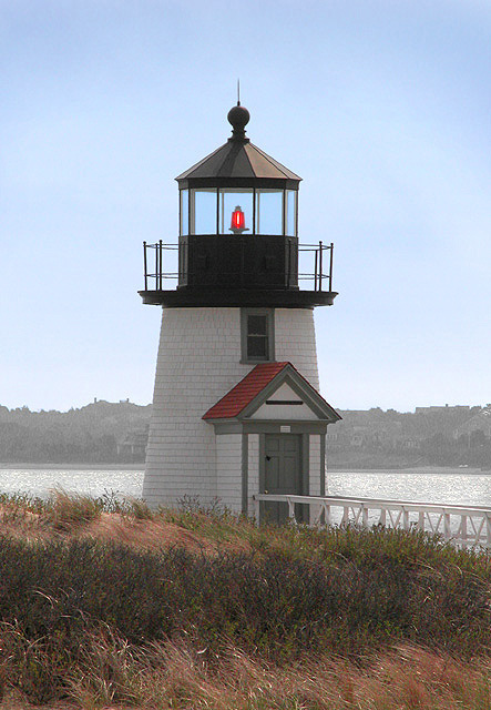
| Beautiful capture of this lighthouse. |
|
 Photographer found comment helpful. Photographer found comment helpful. |
|
|
01/22/2005 10:08:17 PM |
| this looks like it would be a nice place to shoot. just wish you had come at a more interesting time of day (morning or late afternoon), and that you had chosen a perspective that made use of the unique architecture of the lighthouse. as is, this comes off a bit snap-shotty (ie, uninteresting, except to document that you've been there). good luck! |
|
| Photographer found comment helpful. |
|
|
01/21/2005 06:26:34 PM |
| Nice, but doesn't wow me. |
|
| Photographer found comment helpful. |
|
|
01/18/2005 08:22:27 AM |
| Nice shot but the haze takes away to much from the picture. Perhaps doing selective desaturation on this photo would have made it score more where only the reds stood out and the rest B&W. I would be interested in seeing it done this way if you ever do decide to do it. |
|
| Photographer found comment helpful. |
|
|
01/17/2005 05:22:58 PM |
| A nice subject here, though the image seems a little flat - the composition is a bit too straightforward and the haze in the background makes the colouring a little dull. Probably worth a re-shoot on a more photogenic day though. I like the red light in the lighthouse - creates interest against that blue sky. |
|
| Photographer found comment helpful. |
|
|
01/16/2005 11:51:07 PM |
| Cute little light. This looks like it could use a slight CCW rotation to straighten it up. |
|
| Photographer found comment helpful. |
|
|
01/16/2005 09:52:54 PM |
| Lovely photograph of a beautiful place , try increasing the saturation and maybe a bit of sharpening. |
|
| Photographer found comment helpful. |
|
|
01/16/2005 02:49:46 PM |
| a bit too centered for my taste , the lighthouse towards the left with more railing showing would have been more dynamic |
|
| Photographer found comment helpful. |
|
|
01/16/2005 01:01:00 PM |
| Good subject, but too centered. |
|
| Photographer found comment helpful. |
|
|
01/16/2005 05:13:41 AM |
| Good photo, composition could be better if the lighthouse was more off center. |
|
| Photographer found comment helpful. |
|
|
01/16/2005 12:11:25 AM |
| that bright red dot and the red roof really stands out in this picture.. it seems almost fake against the more muted colors.. it looks almost like you upped the red channel saturation level. i would like it a lot better if that weren't so distracting |
|
| Photographer found comment helpful. |
Home -
Challenges -
Community -
League -
Photos -
Cameras -
Lenses -
Learn -
Help -
Terms of Use -
Privacy -
Top ^
DPChallenge, and website content and design, Copyright © 2001-2025 Challenging Technologies, LLC.
All digital photo copyrights belong to the photographers and may not be used without permission.
Current Server Time: 03/13/2025 01:23:54 AM EDT.