| Author | Thread |
Comments Made During the Challenge  |
|
|
01/23/2005 06:23:33 PM |
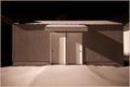
| I would have like this shot a lot more if I saw a bit less of that grass, a little more crop would have made this picture a lot better in my opinion. |
|
 Photographer found comment helpful. Photographer found comment helpful. |
|
|
01/20/2005 03:58:00 PM |
| It's certainly a very architectural photo; even looks like one of those architect's drawings! It's also a very well-conceived & executed view of an interesting building. 7. |
|
| Photographer found comment helpful. |
|
|
01/18/2005 07:03:20 PM |
| This is a striking design study but the angle and distance make it have much less impact. If you were to concentrate on one aspect of the building and crop it just right, it would do very well. |
|
| Photographer found comment helpful. |
|
|
01/17/2005 05:35:17 AM |
the colours are a bit washed out in my opinion
|
|
| Photographer found comment helpful. |
|
|
01/17/2005 05:25:01 AM |
| In many ways this is the best "pure" architectural photograph in the challenge. That is to say, it looks like it was shot by/for an architect. The light and values are striking, if udnerstaed. Unfortunately, it's far from sharp. Hell of a building, though. |
|
| Photographer found comment helpful. |
|
|
01/17/2005 04:39:10 AM |
|
| Photographer found comment helpful. |
Home -
Challenges -
Community -
League -
Photos -
Cameras -
Lenses -
Learn -
Help -
Terms of Use -
Privacy -
Top ^
DPChallenge, and website content and design, Copyright © 2001-2025 Challenging Technologies, LLC.
All digital photo copyrights belong to the photographers and may not be used without permission.
Current Server Time: 03/12/2025 05:53:34 PM EDT.