| Author | Thread |
|
|
01/26/2005 10:40:32 PM |
|
Comments Made During the Challenge  |
|
|
01/25/2005 07:39:29 PM |
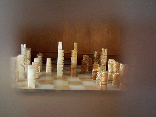
| Neat vignette shot.Too bad the edges are a bit greyish. Could have been more powerful with balck surrounding. |
|
|
|
01/25/2005 06:55:30 AM |
| a good idea, but the subject is a little dull (and slightly wonkey) |
|
|
|
01/25/2005 02:40:48 AM |
| While the vignette effect is OK, I think the chess subject is too commonly seen to have much "new" appeal. And the tilt & off-centre composition detracts a bit from your intention as well. Sorry. 4. |
|
|
|
01/23/2005 04:03:07 PM |
|
|
|
01/21/2005 10:12:18 PM |
|
|
|
01/20/2005 03:20:46 PM |
| Lines are tilted.....distracting |
|
|
|
01/20/2005 10:58:32 AM |
| that slight right tilt does not work |
|
|
|
01/19/2005 07:52:36 PM |
| Would have liked this better if the back wall had been darker or blurred. As it is, it intrudes and is nearly as important as the subjects. |
|
|
|
01/19/2005 09:05:39 AM |
| A bit tilted spoils this effect, also the sharp edge of the board itself spoils the smoothness above |
|
|
|
01/19/2005 12:47:35 AM |
| I LOVE it. :) Good luck with this one. |
|
Home -
Challenges -
Community -
League -
Photos -
Cameras -
Lenses -
Learn -
Help -
Terms of Use -
Privacy -
Top ^
DPChallenge, and website content and design, Copyright © 2001-2025 Challenging Technologies, LLC.
All digital photo copyrights belong to the photographers and may not be used without permission.
Current Server Time: 03/12/2025 02:03:59 AM EDT.