| Author | Thread |
|
|
01/28/2005 03:00:00 PM |
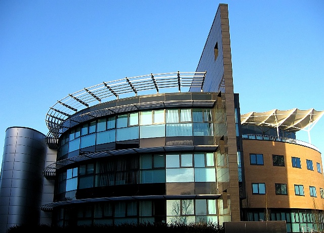
I really like the architecture of this building - has such a great use of line, shape, and texture. I like the mix of blues and browns, and the texture provided by the items on top of both sides of the building.
As far as composition - none of your "vertical lines" are truly vertical. You have a perspective issue that complicates the situation -common in architectural photography. If this were my shot, I would do one of two things.
Suggestion 1: Choose an area of the photo roughly in the middle, in this case where the shadow line makes such a big difference in lighting slightly to the left of center. I would rotate the image such that the vertical line here is truly vertical in the frame and the horizontal area there should be level with the bottom of the frame. At this point you could leave it as it is.
or
Suggestion 2: Do step one and then do a perspective correction in photoshop by "selecting all" and then pulling the upper corners out just enough to make the outside walls vertical. Then do a final crop.
I also think you were fighting lighting here . . part of the building is in the sun, part partially shaded, and the far left much deeper shade impacts the quality of the photo. Perhaps a curves adjustment in photoshop could lighten that darkest area. |
|
 Photographer found comment helpful. Photographer found comment helpful. |
Comments Made During the Challenge  |
|
|
01/23/2005 08:36:47 PM |
| Great find...appears to be oversharpened though. A little bit wider capture could give the edges more breathing room, and a slight perspective shift could make the sides of the buildings more vertical instead of appearing to lean in. Nice color, a few overexposed hot spots but overall a good entry choice. |
|
| Photographer found comment helpful. |
|
|
01/23/2005 08:17:31 PM |
Too much USM?
Which is the better half? :) |
|
| Photographer found comment helpful. |
|
|
01/23/2005 06:19:06 PM |
| Great photo, interesting building. Too bad about the boring sky but that can't be helped. |
|
| Photographer found comment helpful. |
|
|
01/20/2005 09:55:14 PM |
| Neither of which should ever have been constructed. Happily, your photo is a bit better than the building. 5. |
|
| Photographer found comment helpful. |
|
|
01/17/2005 10:57:25 PM |
| Good composition. When you dowsize your picture be sure that the algorythm you choose is not nearest neighbor, whatever program you use. Using nearest neighbor is the reason why you have so much jaggies. |
|
| Photographer found comment helpful. |
|
|
01/17/2005 12:59:35 PM |
| The lines in this image seem very pixelated - I don't know if that's too much sharpening or some other post-process. Anyway, I like the composition and the interesting subject. |
|
| Photographer found comment helpful. |
|
|
01/17/2005 12:52:41 AM |
| Very cool. Can't wait to see where this is. |
|
| Photographer found comment helpful. |
Home -
Challenges -
Community -
League -
Photos -
Cameras -
Lenses -
Learn -
Help -
Terms of Use -
Privacy -
Top ^
DPChallenge, and website content and design, Copyright © 2001-2025 Challenging Technologies, LLC.
All digital photo copyrights belong to the photographers and may not be used without permission.
Current Server Time: 03/12/2025 03:14:22 PM EDT.