| Author | Thread |
Comments Made During the Challenge  |
|
|
05/12/2002 11:40:00 AM |
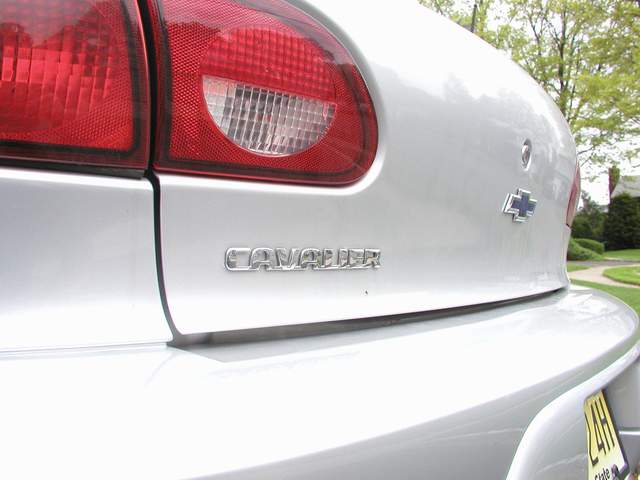
| Sorry you are trying to sell good old american technology with a car that has such poor alignment of body parts. Good pic though. |
|
|
|
05/11/2002 12:08:00 PM |
| Nice idea to zero in on the car name. That is a trend in car advertisements these days. You might have projected more of a feel of a new car ad if you didn't have the car tag showing though. |
|
|
|
05/11/2002 07:18:00 AM |
|
|
|
05/11/2002 06:12:00 AM |
| Somewhat uninspiring - you should try something involving the entire car in some sort of creative way or location. |
|
|
|
05/11/2002 04:11:00 AM |
| Steal it from your driveway? {jk} For a detail shot like this, I'd like to see you get even closer and really home in on one design element of the car. The angled view along the rear here with hotspots and reflections, houses, lawn, etc. in the background isn't the most effective way to show this product. |
|
|
|
05/10/2002 02:46:00 PM |
| Nice picture, doesn't show much of the product though. |
|
|
|
05/09/2002 12:01:00 PM |
| jersey, the diner state. i think there is too much relflection off of your rear end |
|
|
|
05/08/2002 12:08:00 PM |
| Nice how you captured the shape of the car. I think it's a pity that the "cavalier"-text is difficult to read tough. Perhaps you should have taken the picture in a sligthly different angle. |
|
|
|
05/08/2002 10:54:00 AM |
| All the lines in the picture leade me to that house in the distance. While I like the use of curves (especially how the sidewalk kind of echoes the car) it doesn't show me much of what the car really looks like -- important to me when buying a car. While this isn't the kind of advice I like to give, I think you might be better off going with a different shot (in terms of advertising) or going for even more of an abstraction by getting even closer. |
|
|
|
05/07/2002 06:36:00 AM |
I htought about a similar shot with my 1989 volvo but it didn't have quite the right effect........
nice reflections though |
|
|
|
05/06/2002 07:10:00 PM |
| Unique viewpoint. Dull coloring. |
|
|
|
05/06/2002 06:53:00 PM |
| I would not buy this car based on the name plate, but bonus points since you're from NJ |
|
|
|
05/06/2002 02:36:00 PM |
| Nice angle to the shot, its a bit overexposed in the bottom left corner and the yellow plate is a slight distration. Would of been nice if you had the chance to shoot this on a day that there was not any overcast but that is out of your control. |
|
|
|
05/06/2002 01:56:00 PM |
| I like this picture a lot. It`s shiny, curvy & the colours are spot on too. |
|
|
|
05/06/2002 10:35:00 AM |
| Technically a good photo, but a boring advert. What's up with the title? Photo 9 Advert 5 total 7 |
|
|
|
05/06/2002 09:37:00 AM |
| This is a good shot... the light is a little bright in the reflections on the lower left side of the frame. |
|
|
|
05/06/2002 09:36:00 AM |
I think this would of been better with a tighter crop on the name and the tail light.
Wow you've got a clean car! |
|
|
|
05/06/2002 07:42:00 AM |
| little black mark under the cavalier sign. |
|
|
|
05/06/2002 06:48:00 AM |
| Typically if I want to buy a car, I'd like to see the whole thing. I don't feel tightly cropped shots of parts of a car really do a good job to sell the car. |
|
Home -
Challenges -
Community -
League -
Photos -
Cameras -
Lenses -
Learn -
Help -
Terms of Use -
Privacy -
Top ^
DPChallenge, and website content and design, Copyright © 2001-2025 Challenging Technologies, LLC.
All digital photo copyrights belong to the photographers and may not be used without permission.
Current Server Time: 03/12/2025 03:26:44 PM EDT.