| Author | Thread |
|
|
07/09/2003 06:49:16 AM |
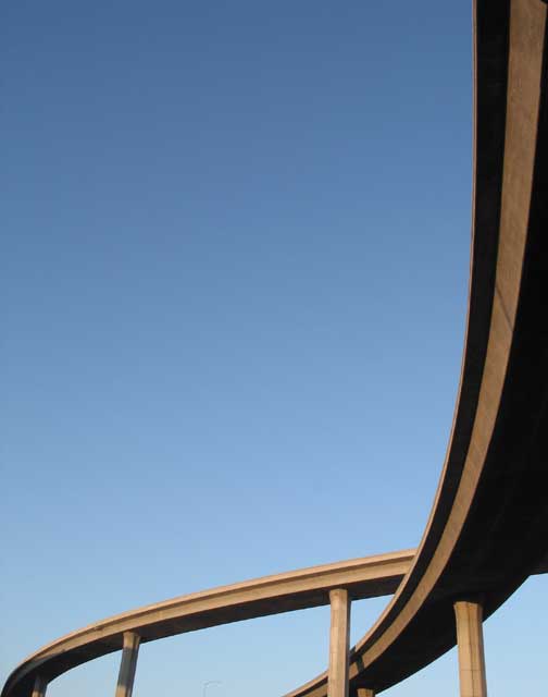
| Very nice! This ranks high IMO. That drab concrete can actually look as suave as a ribbon is depicted here very stylishly. |
|
|
|
03/23/2003 11:19:39 AM |
CRITIQUE CLUB CRITIQUE
by karmat
COMPOSITION
I like how you have taken a picture of something "ordinary," or at least common, and used made it interesting by making it into an abstract. It is composed really well, I think, because the eye follows the ramp down the right and across the frame at the bottom, then loops back. excellent. Did you try flipping so that it would be a left to right flow? I don't know that it would have been necessarily better, just different.
The sky also produces negative space which is very effective in this shot to emphasize the bridges.
TECHNIQUE
The blue sky really makes this shot, though it almost seems a touch blown out at the bottom. Not enough to really detract though. I, personally, do not see the artifacts others are mentioning, but then again, maybe I need glasses or something. To me, it looks focused and clear. I like the way hte shadows help accentuate the motion. I do see some the moire pattern or banding in the sky. Perhaps NEATIMAGE, or another similar filter could help smooth that out
OVERALL EFFECT
This shot seems to serve to show the vastness of the road system. Though it is but a small part, and is a simple picture, it speaks of the massive confusion that sometimes comes when trying to navigate such things (especially for me!)
Good work and best to you in future challenges |
|
Comments Made During the Challenge  |
|
|
03/16/2003 01:09:15 AM |
| Glad to see someone else use freeway ramps...like your cropping/framing. |
|
|
|
03/16/2003 12:43:48 AM |
The twisting ribbon-like quality is brought well by the exceptional placement in the overpass intersection in the lower left quadrant.
The sinuous quality is outstanding. It is emphasized by the two parts of the overpass stretching to opposite sides of the image. Well cropped.
Simple is better and that is certainly true of this image. |
|
|
|
03/15/2003 04:16:36 PM |
|
|
|
03/15/2003 04:00:22 PM |
| maybe a little too much negative space and your photo is only 12.5 kb which explains the jagged effect from compression. Still not bad from only 12.5kb. |
|
|
|
03/14/2003 11:39:28 AM |
| Grrrr, youve ruined a great shot by compressing down to 12k. |
|
|
|
03/13/2003 03:30:34 PM |
|
|
|
03/13/2003 09:28:37 AM |
| Excellent shot, the crop is very good. It looks like a piece of art. Good one. |
|
|
|
03/13/2003 04:34:12 AM |
| Beautiful...very good eye. There seems to be some unfortunate moirée patterning in the sky (pretty sure it's not my monitor as I can scroll up and down and it moves with the image) but that's a purely technical issue which mightn't be avoidable. This would make a good black and white, too. |
|
|
|
03/13/2003 03:18:45 AM |
| Interesting and IMHO well done composition / cropping, I like it. Perhaps some more contrasts or structures (clouds) in the sky could have been helpful here, but I can't change the weather too ;-) Good luck for the challenge - 9 |
|
|
|
03/13/2003 01:18:34 AM |
| okay on the arteries, but I think just a bit too much blue sky? A wider lens and more bridge/arteries may have been better. . . |
|
|
|
03/12/2003 03:39:57 PM |
| I really like the composition of this photo.. all the blue negative space is wonderful. However, I wish there was more detail on the bridge to the right - it looks like you used neatimage and it erased much of that detail. Too bad! 8 for a great photo anyway! |
|
|
|
03/12/2003 09:05:46 AM |
| nice curves... i like the composition, but the sky is a little noisy...one of the bridges is pixelated on the bottom, too. |
|
|
|
03/12/2003 02:43:35 AM |
| Too much empty space, I think. |
|
|
|
03/12/2003 01:17:17 AM |
| Good use of Neg space. Good perspectice. |
|
|
|
03/11/2003 11:58:45 PM |
| Great composition. Great use of negative space. I like it. |
|
|
|
03/11/2003 10:41:26 PM |
| Elegant and simple! Well done. |
|
|
|
03/11/2003 05:37:17 PM |
| Good minimalistic composition. |
|
|
|
03/11/2003 04:32:17 PM |
|
|
|
03/11/2003 10:06:38 AM |
| nice negative space. cool shot. |
|
|
|
03/11/2003 05:23:06 AM |
| Very simple desing but it works well. |
|
|
|
03/11/2003 01:44:49 AM |
| Great Compo. Simple works great here. |
|
|
|
03/10/2003 05:51:17 PM |
|
|
|
03/10/2003 04:35:00 PM |
| This is a beautiful photo.. the negative space works very well and the exposure offers very nice contrast... great work :) = 10 - setzler |
|
|
|
03/10/2003 09:29:54 AM |
| Excellent use of negative space. I enjoy the cropping on this quite a bit. |
|
|
|
03/10/2003 07:51:11 AM |
| Absolutely amazing composition!! I am kind of concerned that I can see what I think are jpeg artifcats however??? |
|
|
|
03/10/2003 12:53:12 AM |
| I imagine that this is croped to show only the bridge. Nice sharp focus and good lighting. Nice scale for height in front and low in the background. Fits the challenge well. |
|
|
|
03/10/2003 12:28:13 AM |
|
Home -
Challenges -
Community -
League -
Photos -
Cameras -
Lenses -
Learn -
Help -
Terms of Use -
Privacy -
Top ^
DPChallenge, and website content and design, Copyright © 2001-2025 Challenging Technologies, LLC.
All digital photo copyrights belong to the photographers and may not be used without permission.
Current Server Time: 03/12/2025 07:45:10 AM EDT.