| Author | Thread |
Comments Made During the Challenge  |
|
|
01/31/2005 03:01:29 PM |
|
|
|
01/30/2005 07:38:39 AM |
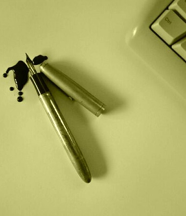
| I don't really like the colour tones here, somewhat it reminds me to a failed WB setup, or, if it was the purpose, it dowsn't really give me the Matrix feeling. I would change your composition as well, for example a diagonal one with the keyboard, which divides your photo to two equal parts, one for old and one for new. I would choose a lower angle as well, approaching from the side of the pen. The idea is nice but could be implemented with a higher quality. |
|
|
|
01/29/2005 08:12:08 AM |
| is the yellowish tint on purpose? If so, I don't quite see it. |
|
|
|
01/27/2005 12:28:22 PM |
| At first I thought you should show more of the keyboard, but then I realized that you knew what you were doing. :) (The keyboard would have dominated the pen if more of it was shown). I suppose there could be a hidden (or intentional?) meaning in choosing to show only the "ctrl" key--contrasting the modern "control" or rigidity vs. the "messiness" of prior times. Or maybe I'm reading too much into it... |
|
 Photographer found comment helpful. Photographer found comment helpful. |
|
|
01/26/2005 11:45:56 PM |
| great idea, too much white space for my taste. The green cast I don't like - but maybe you were going for that. nice creative though, I really like the idea |
|
| Photographer found comment helpful. |
|
|
01/26/2005 05:41:15 PM |
| The shot is all great, but the color is off... it's very yellow. |
|
|
|
01/26/2005 06:53:12 AM |
| So you're saying that fountain pen users have a lack of 'ctrl' over the ink? I think using a keyboard of a different color than the background would make it more distinguishable. Otherwise, good picture. |
|
| Photographer found comment helpful. |
|
|
01/26/2005 01:26:05 AM |
| Would have been great with the white balance adjusted. |
|
| Photographer found comment helpful. |
|
|
01/26/2005 12:44:05 AM |
| I would not have had put the pen next to the keybord |
|
Home -
Challenges -
Community -
League -
Photos -
Cameras -
Lenses -
Learn -
Help -
Terms of Use -
Privacy -
Top ^
DPChallenge, and website content and design, Copyright © 2001-2025 Challenging Technologies, LLC.
All digital photo copyrights belong to the photographers and may not be used without permission.
Current Server Time: 03/14/2025 11:59:47 AM EDT.