| Author | Thread |
Comments Made During the Challenge  |
|
|
01/29/2005 08:01:29 PM |
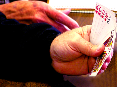
| This photo looks way too saturated as the hands have a lot of noise on the. The size is ok, but you will generally do a lot better if you use the full 640 measurements. |
|
 Photographer found comment helpful. Photographer found comment helpful. |
|
|
01/29/2005 07:55:46 PM |
| Either this is the shot of the lifetime... Or this staged, staged shot would have used proper lightning so I am assuming the former. |
|
| Photographer found comment helpful. |
|
|
01/29/2005 09:25:42 AM |
| Interesting as you included the face cards! |
|
| Photographer found comment helpful. |
|
|
01/27/2005 04:50:39 PM |
| Way too small to make a judgement - use the full 640 pixels to allow the image to stand some chance |
|
| Photographer found comment helpful. |
|
|
01/26/2005 09:58:03 PM |
| First, I recommend that you try a larger image next time. The crop is a bit too tight. It's a good idea, I mean poker is definitely "normal activity" (quoted from the challenge guidelines), but I think it could've been presented differently. As it is this is a very average shot. |
|
| Photographer found comment helpful. |
|
|
01/25/2005 02:04:41 AM |
| interesting. to me this one is a bit of a stretch from the topic. def faceless but all u do see are 2 hands... |
|
| Photographer found comment helpful. |
|
|
01/25/2005 12:07:01 AM |
| A little too small. Make it bigger so we can see more detail. |
|
| Photographer found comment helpful. |
|
|
01/24/2005 08:35:41 AM |
| Must be playing Pinochle. Nice idea fora photo. |
|
| Photographer found comment helpful. |
|
|
01/24/2005 01:08:42 AM |
|
| Photographer found comment helpful. |
|
|
01/24/2005 12:35:04 AM |
|
| Photographer found comment helpful. |
Home -
Challenges -
Community -
League -
Photos -
Cameras -
Lenses -
Learn -
Help -
Terms of Use -
Privacy -
Top ^
DPChallenge, and website content and design, Copyright © 2001-2025 Challenging Technologies, LLC.
All digital photo copyrights belong to the photographers and may not be used without permission.
Current Server Time: 03/14/2025 11:59:57 AM EDT.