| Author | Thread |
|
|
02/08/2005 02:27:42 PM |
*** C R I T I Q U E C L U B C O M M E N T ***
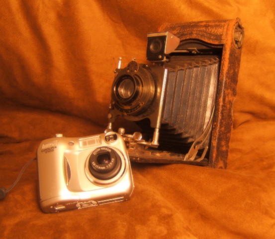
Speaking of this as a photograph (as opposed to a challenge entry) one immediately notices 3 things; it's out of focus or softened too much, the color cast is way warm, and the background dominates the image. All of these are unnatural looking components of the image, and taken together make it not work very well.
The choice of BG color is also questionable, as it too-closely matches up with the colors on the old camera's leather casing.
Speaking of this as a challenge entry, I'd comment that all of the above caused the image to be downgraded in score, and it wasn't helped by the fact that it was only one of many "old v new" camera shots.
Assuming you had wanted to continue with this theme, and interesting approach to take might have been to split the background diagonally frum upper left to lower right and have an "old" and a "new" background also, perhaps one shiny and the other like the one you chose, but a different color.
Overall, it seems a failed image, basically, soft and static with most of the attention grabbed by the overly complex BG.
Robt. |
|
Comments Made During the Challenge  |
|
|
02/01/2005 11:36:34 AM |
|
|
|
02/01/2005 03:35:20 AM |
| Several people come up with the same idea. Some take a little further with just a little more composition work, as you have done here. Yours was one of the few that wasn't just a couple of cameras in the same picture. |
|
|
|
01/31/2005 03:35:10 PM |
| Good idea for the challenge. Maybe a tighter crop could make the composition more interesting. |
|
|
|
01/30/2005 08:49:27 PM |
| Good shot. Seems a bit out of focus. |
|
|
|
01/29/2005 11:50:36 AM |
| too soft focus and the composition doesnt work very well |
|
|
|
01/29/2005 01:11:37 AM |
| Several thing come to me when I see a picture like this. Firstly, this is the 20th of this subject that I have seen in this competetion, what makes this one so unique and interesting? When selecting a composition for the challenges, you'll find that certain subjects are rather commonplace and when you come into an overlap situation such as that, yours had better be damn good or you lose simply through association. The old and new camera is that type of photo. The old camera that you have on display is really a beautiful subject and has been diminished to a boring catalogue piece of metal. The background does not enhance the old camera but rather washes it out. The new camera has glare on it and the whole photo is slightly out of focus. The shot appears to be a show and tell type of photo lacking any creative effort. The subjects are too centered which also weakens the composition. Your photo does meet the challenge definition but does not inspire the viewer to look at it any further than that. Good luck. |
|
 Photographer found comment helpful. Photographer found comment helpful. |
|
|
01/27/2005 02:03:06 PM |
| positioning not soo good im afraid.thats a pity |
|
| Photographer found comment helpful. |
|
|
01/27/2005 01:59:15 AM |
| I like the retro feel of this photo, but soft focus i think is unnecessary |
|
| Photographer found comment helpful. |
|
|
01/26/2005 05:47:09 PM |
|
| Photographer found comment helpful. |
|
|
01/26/2005 02:22:14 PM |
| great idea...tried it myself...focus too soft for my liking, would have hid the digital camera's strap or got it all in too. Good luck |
|
| Photographer found comment helpful. |
|
|
01/26/2005 02:09:50 PM |
| Many used this idea, but it's a good composition nonetheless. I like the consistant color scheme. |
|
| Photographer found comment helpful. |
Home -
Challenges -
Community -
League -
Photos -
Cameras -
Lenses -
Learn -
Help -
Terms of Use -
Privacy -
Top ^
DPChallenge, and website content and design, Copyright © 2001-2025 Challenging Technologies, LLC.
All digital photo copyrights belong to the photographers and may not be used without permission.
Current Server Time: 03/15/2025 09:05:54 AM EDT.