| Author | Thread |
Comments Made During the Challenge  |
|
|
02/01/2005 10:11:08 PM |
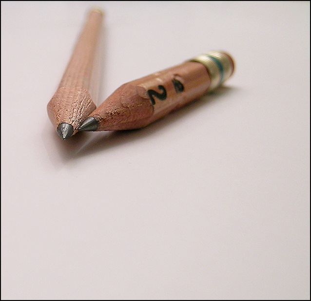
| The white space around your subjects could be a little whiter....it kinda has a pinky shade to it.Nice image though. Composed well |
|
 Photographer found comment helpful. Photographer found comment helpful. |
|
|
02/01/2005 07:59:10 PM |
| It would be better if the back of the long pencil wasn't blurry in the back because other wise I can barely see the distance of it. Very nice photo and nice centering. |
|
| Photographer found comment helpful. |
|
|
01/31/2005 12:34:46 AM |
| This pic is great. I think it should have been centered more though, and I would have upped the clarity on the shorter pencil, and begun the blur on the longer pencil a little farther away. Hard to explain, but overall good shot! |
|
| Photographer found comment helpful. |
|
|
01/30/2005 09:01:15 PM |
| Maybe crop it in a little more. Great shot. |
|
| Photographer found comment helpful. |
|
|
01/29/2005 10:05:39 PM |
|
| Photographer found comment helpful. |
|
|
01/29/2005 02:07:56 AM |
| The composition is good but I really don't like all the space below the images imo ofcourse |
|
| Photographer found comment helpful. |
|
|
01/28/2005 11:03:09 PM |
| I think I would like it better if the depth of field were a little wider. Of course, I may just be jelous because my camera won't to thet. :) |
|
| Photographer found comment helpful. |
|
|
01/28/2005 03:05:19 PM |
| I was going to do this same thing, but couldn't get it the way I wanted it... I went with something else! |
|
| Photographer found comment helpful. |
|
|
01/27/2005 12:39:06 PM |
| interesting take on the challenge |
|
| Photographer found comment helpful. |
|
|
01/27/2005 01:14:15 AM |
| I like the idea, but the pencils being pointed toward the left edge of the picture causes the entire lower-right portion of the picture to be merely wasted space. Perhaps cropping could help, or keeping the composition the same but with the short pencil on the other side of the longer one. |
|
|
|
01/26/2005 04:59:03 PM |
|
| Photographer found comment helpful. |
|
|
01/26/2005 02:10:20 PM |
| Interesting idea, I would probably crop more tightly at the bottom. (8) |
|
| Photographer found comment helpful. |
|
|
01/26/2005 04:48:16 AM |
I like the idea but for me the DOF is just a bit too shallow which is distracting. Not keen on the shadows under the pencils either and looks a bit oversharpened (the image not the pencils - no pun intended).
Nice to see something other than the obvious cameras, phones, buildings, flowers & rolls of film vs. memory cards though. |
|
| Photographer found comment helpful. |
Home -
Challenges -
Community -
League -
Photos -
Cameras -
Lenses -
Learn -
Help -
Terms of Use -
Privacy -
Top ^
DPChallenge, and website content and design, Copyright © 2001-2025 Challenging Technologies, LLC.
All digital photo copyrights belong to the photographers and may not be used without permission.
Current Server Time: 03/12/2025 08:12:12 PM EDT.