| Author | Thread |
Comments Made During the Challenge  |
|
|
02/03/2005 08:06:31 PM |
|
|
|
02/03/2005 04:46:18 AM |
| Boring idea, bad lighting, bad framing. I cant say i like anything about this shot. sorry. 3. |
|
|
|
01/30/2005 09:07:20 PM |
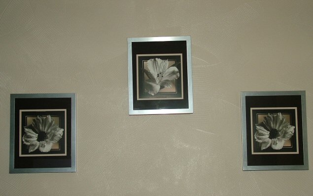
| While you met the criteria of the challenge, this subject is uninteresting and poorly executed. The framed art is too far apart and from the angle of the camera appears to be crooked. If you had taken these frames off of the wall and put them against a more interesting background close together, this image would have been better. |
|
|
|
01/29/2005 07:42:53 PM |
| The design on the wall is a distraction |
|
|
|
01/29/2005 12:53:50 PM |
| Sorry but I think this just lacks an enormous amount of creativity. The symmetry is not quite accurate enough, the verticals or not vertical and the lighting is flat. Also the background is rather dull. I hate being this critical, but the shot appears to be thrown together without any real thought, and those kind of shots don't do well on here. Being different and original can sometimes overcome some technical shortcomings, but you have to have at least one of those elements to stand a chance of a decent score. |
|
|
|
01/28/2005 12:02:59 AM |
| Make sure to level the photo so that the frames are parallel with the border of the picture |
|
Home -
Challenges -
Community -
League -
Photos -
Cameras -
Lenses -
Learn -
Help -
Terms of Use -
Privacy -
Top ^
DPChallenge, and website content and design, Copyright © 2001-2025 Challenging Technologies, LLC.
All digital photo copyrights belong to the photographers and may not be used without permission.
Current Server Time: 03/12/2025 12:25:08 PM EDT.