| Author | Thread |
Comments Made During the Challenge  |
|
|
02/02/2005 05:48:07 PM |
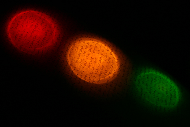
| This one's interesting after seeing all the other cliche ridden staged photos. I would've preferred the orientation to be vertical so the viewer can take in some of the words on the page. In this way the photo would've achieved immediate accessible depth and taken away from its 'threeness' for a moment. Still, I applaud your efforts. |
|
 Photographer found comment helpful. Photographer found comment helpful. |
|
|
01/29/2005 08:10:56 PM |
| Somewhere there is a town missing a traffic light. Great shot and imagination |
|
| Photographer found comment helpful. |
|
|
01/29/2005 04:15:40 AM |
| As a thumbnail one couldn't see the writing, but now it's obvious. Green doesn't have the intensity of the others and red is a bit dimmer as well, but idea is great and execution, while not perfect, supports it well. I especially like the caustics on the light and the fact you didn't use just simple paper. |
|
| Photographer found comment helpful. |
Home -
Challenges -
Community -
League -
Photos -
Cameras -
Lenses -
Learn -
Help -
Terms of Use -
Privacy -
Top ^
DPChallenge, and website content and design, Copyright © 2001-2025 Challenging Technologies, LLC.
All digital photo copyrights belong to the photographers and may not be used without permission.
Current Server Time: 03/16/2025 05:18:53 AM EDT.