| Author | Thread |
Comments Made During the Challenge  |
|
|
02/06/2005 12:37:43 AM |
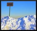
| The telstra logos are more pronounced than your sign and takes a little away from it compositionally .. I like the concept, I think it just needs a little more work. Maybe in the colour balance / distribution? |
|
|
|
02/05/2005 06:38:06 AM |
| Yes I can Bruce..... or Kirsty... or Brett.. lol |
|
 Photographer found comment helpful. Photographer found comment helpful. |
|
|
02/05/2005 06:10:27 AM |
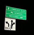
| Unfortunately, the sign looks too eroded to have a lot of impact against the 'phone booths. It looks as if the focus is on the vehicle rather than the foreground. |
|
|
|
02/02/2005 05:55:43 PM |
|
| Photographer found comment helpful. |
|
|
02/02/2005 02:33:06 PM |
| no, won't even go there...nice idea |
|
| Photographer found comment helpful. |
Home -
Challenges -
Community -
League -
Photos -
Cameras -
Lenses -
Learn -
Help -
Terms of Use -
Privacy -
Top ^
DPChallenge, and website content and design, Copyright © 2001-2025 Challenging Technologies, LLC.
All digital photo copyrights belong to the photographers and may not be used without permission.
Current Server Time: 03/12/2025 10:30:42 PM EDT.