| Author | Thread |
|
|
02/09/2005 09:58:43 PM |
| I did'nt realize I made a spelling error in the title, oh well. thanks for all of the helpful comments. I'm new at this and i'll take all of the constructive critisism i can get |
|
Comments Made During the Challenge  |
|
|
02/08/2005 06:45:49 PM |
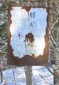
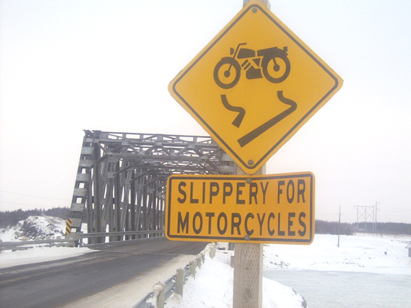
| might have suggested playing up the fact that the sign looks very facelike, and avoid the repetition of the sign text in the image title. |
|
|
|
02/08/2005 12:49:01 AM |
| Your photo needs more contrast, that yellow could have more punch to it. Was the spelling mistake deliberate? |
|
 Photographer found comment helpful. Photographer found comment helpful. |
|
|
02/05/2005 05:14:21 AM |
| The sign looks a little washed out, unfortunately. |
|
|
|
02/04/2005 12:57:28 PM |
| I think the ice is a dead giveaway. LOL... The image is over-exposed: the light areas are entirely white, and the shadow areas are not dark enough. You can't fix the whites, but either levels or curves can help the shadows. |
|
| Photographer found comment helpful. |
|
|
02/02/2005 10:38:05 PM |
| Nice sign, but the photo is a little too washed out for my tastes. |
|
|
|
02/02/2005 01:51:46 PM |
|
|
|
02/02/2005 01:50:35 PM |
| This photo has a good frame to it, but would be even better if you had a peson in the background riding a motorcycle. |
|
| Photographer found comment helpful. |
|
|
02/02/2005 09:54:55 AM |
| Maybe a black and white would help with what I am assuming was a fog issue. 7 |
|
| Photographer found comment helpful. |
|
|
02/02/2005 04:13:19 AM |
| IT IS TOO BRIGHT....BUT THE SIGN IS VERY UNIQUE |
|
| Photographer found comment helpful. |
|
|
02/02/2005 02:02:12 AM |
|
Home -
Challenges -
Community -
League -
Photos -
Cameras -
Lenses -
Learn -
Help -
Terms of Use -
Privacy -
Top ^
DPChallenge, and website content and design, Copyright © 2001-2025 Challenging Technologies, LLC.
All digital photo copyrights belong to the photographers and may not be used without permission.
Current Server Time: 03/11/2025 01:21:44 PM EDT.