| Author | Thread |
Comments Made During the Challenge  |
|
|
02/06/2005 08:33:09 AM |
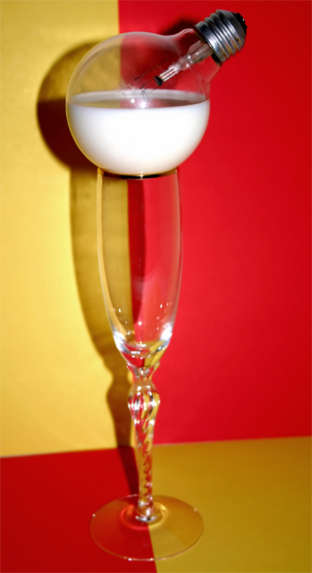
| i'll give you an A for effort! please take all comments for what they are, and don't take them personally. i think it is so cool for you to be trying this. the main thing is, no matter how it scores or whatever comments you get, keep on trying new things. learn how to use your camera and keep on pushing your imagination. good luck! |
|
|
|
02/05/2005 05:50:51 PM |
| Interesting idea, but it seems out of focus and the lighting is not very good. Also, a different choice of angle would have helped the horizon. |
|
|
|
02/05/2005 01:41:34 PM |
| A great idea, the shadows are distracting though... |
|
|
|
02/04/2005 05:58:49 AM |
| It seems like you've taken a lot of trouble for minimal effect ... a confused mix of DP Challenge cliches, and alas it's rather poorly composed, lit and photographed as well. I'm afraid I can offer no more constructive advice than this: go outside and take a real photograph of something. Take plenty. Leave this studio rubbish to the poor souls who revel in it. Sorry. 4 |
|
|
|
02/03/2005 11:35:30 PM |
| clever idea, but I think it would have been more effective if you put the glas a further distance from the background to remove the hars shadow. It also seems slightly blurred... |
|
|
|
02/03/2005 11:24:41 AM |
| interesting idea. Looks like it could be a little sharper in focus |
|
|
|
02/02/2005 05:16:18 AM |
| Great idea but the shadow kinda kills it. Maybe next time try moving the whole subject further away from the background and zooming in. |
|
|
|
02/02/2005 05:10:33 AM |
|
|
|
02/02/2005 01:29:24 AM |
| Interesting idea, but to much shadow and focus on the glass is off. |
|
|
|
02/01/2005 12:39:38 PM |
|
|
|
01/31/2005 05:03:56 PM |
| interesting play on words for the theme. as a matter of fact it was udderly funny |
|
|
|
01/31/2005 04:02:55 PM |
| Good attempt. But a couple of things would help a lot. Firstly, the focus needs to be shaper. Second, the horizontal red/yellow line is not really horizontal, nor is the vertical one vertical. This is a little distracting. Finally, the harsh shadows do not do much for the image- I think it would be a lot cleaner without those harsh shadows. |
|
|
|
01/31/2005 04:14:06 AM |
| Great idea, I think I would prefer the light bulb to be supported in a less obvious way though. |
|
Home -
Challenges -
Community -
League -
Photos -
Cameras -
Lenses -
Learn -
Help -
Terms of Use -
Privacy -
Top ^
DPChallenge, and website content and design, Copyright © 2001-2025 Challenging Technologies, LLC.
All digital photo copyrights belong to the photographers and may not be used without permission.
Current Server Time: 03/13/2025 06:55:51 AM EDT.