| Author | Thread |
Comments Made During the Challenge  |
|
|
02/07/2005 01:02:29 PM |
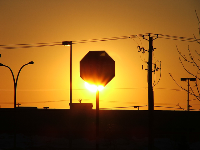
| I think this may have worked better if the light was totally hidden behind the sign. |
|
 Photographer found comment helpful. Photographer found comment helpful. |
|
|
02/06/2005 03:29:23 AM |
| Love the colour. I would, however, prefer to see more sky and less ground at the bottom of the picture. |
|
| Photographer found comment helpful. |
|
|
02/03/2005 10:59:53 AM |
| I keep coming back to this one. Great originality, and good colors. Be careful when you do this kind of photography. (you probably know) It's tough on your eyes. Take care! |
|
| Photographer found comment helpful. |
|
|
02/03/2005 10:55:01 AM |
| This is a good picture. I'd like it more if there was more focus on the sign. The poles seem to distract. |
|
| Photographer found comment helpful. |
|
|
02/02/2005 08:30:04 PM |
|
| Photographer found comment helpful. |
|
|
02/02/2005 04:47:13 PM |
| Even though the background is not much to look at the picture as a whole works well together. Nice job |
|
| Photographer found comment helpful. |
|
|
02/02/2005 12:55:17 PM |
| Looks like flames on the sign. Well done. |
|
| Photographer found comment helpful. |
|
|
02/02/2005 11:18:03 AM |
|
|
|
02/02/2005 10:40:42 AM |
|
|
|
02/02/2005 09:30:57 AM |
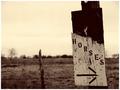
| the sign is great, the rest is distraction to me. I would like to see this cropped right down to the sign |
|
| Photographer found comment helpful. |
|
|
02/02/2005 01:49:35 AM |
| This would be ribbon worthy if it didnt have so many distracting elements to the picture. It may have even been okay if just the didnt have the light posts. |
|
| Photographer found comment helpful. |
Home -
Challenges -
Community -
League -
Photos -
Cameras -
Lenses -
Learn -
Help -
Terms of Use -
Privacy -
Top ^
DPChallenge, and website content and design, Copyright © 2001-2025 Challenging Technologies, LLC.
All digital photo copyrights belong to the photographers and may not be used without permission.
Current Server Time: 03/12/2025 02:44:33 AM EDT.