| Author | Thread |
Comments Made During the Challenge  |
|
|
02/08/2005 06:12:11 PM |
|
|
|
02/06/2005 03:21:33 AM |
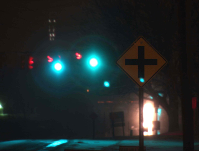
| not good; can barely make out the signa nd the rest of the pic is blurry |
|
|
|
02/04/2005 02:49:33 PM |
| The sign seems too dark against the background and I find the lens flare a little distracting. |
|
 Photographer found comment helpful. Photographer found comment helpful. |
|
|
02/03/2005 05:15:56 AM |
| Good composition, but let down hugely by the blurriness of the image. Night shots like this have to have a tripod! |
|
| Photographer found comment helpful. |
|
|
02/02/2005 05:05:09 PM |
| Everything is too dark even the sign. The lights in the background draw too much attention from the subject. Keep shooting |
|
| Photographer found comment helpful. |
|
|
02/02/2005 09:26:45 AM |
| I like the darkness to this picture. What are the smaller green lights on the sign and just below the right side green light? 5 |
|
| Photographer found comment helpful. |
|
|
02/02/2005 07:51:11 AM |
|
|
|
02/02/2005 04:03:35 AM |
| noisy..sign is out of focus...good try |
|
| Photographer found comment helpful. |
Home -
Challenges -
Community -
League -
Photos -
Cameras -
Lenses -
Learn -
Help -
Terms of Use -
Privacy -
Top ^
DPChallenge, and website content and design, Copyright © 2001-2025 Challenging Technologies, LLC.
All digital photo copyrights belong to the photographers and may not be used without permission.
Current Server Time: 03/11/2025 02:01:31 PM EDT.