| Author | Thread |
Comments Made During the Challenge  |
|
|
02/07/2005 11:36:14 AM |
| lovely forms.and pin sharp too.good shot.congrats |
|
 Photographer found comment helpful. Photographer found comment helpful. |
|
|
02/06/2005 01:00:18 AM |
| The sign needs more grounding... Try rotating the image slightly to make the sign straight. |
|
| Photographer found comment helpful. |
|
|
02/05/2005 11:19:29 PM |
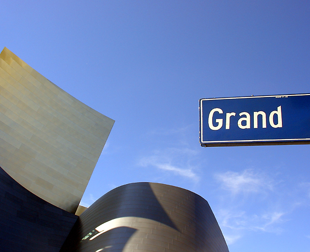
| Technically consummate. Compositionally, I yearned to see a little less sky and a little more of the building that is so undeniably "grand." |
|
| Photographer found comment helpful. |
|
|
02/05/2005 05:04:55 AM |
| Interesting the way the sign is lit. It seems to float in front of the sky. |
|
| Photographer found comment helpful. |
|
|
02/04/2005 08:41:54 PM |
Ahhhhh... the Walt Disney Concert Hall in LA. Wanted to take pictures there on a recent visit, but did not get a chance to and regret it now. Instead I had to suffer over at Venice Beach and the Santa Monica Pier. Fortunately I got some pictures there. :)
Nice shot, good shadows. |
|
| Photographer found comment helpful. |
|
|
02/04/2005 08:38:27 PM |
| Nice composition and colors.. |
|
| Photographer found comment helpful. |
|
|
02/02/2005 08:20:36 PM |
| I love the way this shot was set up. Beautiful color too. |
|
| Photographer found comment helpful. |
|
|
02/02/2005 06:26:51 PM |
| One of a very few that makes sense outside the challenge. Nice use of space. Beautiful flow and shadows in the building. A slight clockwise rotate would have straightened the sign. Perhaps a tad oversharpened? (9) |
|
| Photographer found comment helpful. |
|
|
02/02/2005 03:03:16 PM |
| I like the composition of this shot. It would have been cool if the building wasn't in shadows, but I realize that the architect probably didn't take this into consideration when planning... |
|
| Photographer found comment helpful. |
|
|
02/02/2005 09:04:34 AM |
| I like how you used a sign to your advantage. 8 |
|
| Photographer found comment helpful. |
|
|
02/02/2005 09:00:57 AM |
| I'm not fussy on this shot. I find the shadows on the building is a little to much altho I know you had no control over it. I also find that the sign looks like it was pasted in rather then being part of the picture even if it wasn't. Excelent color and clarity tho. Good luck in this challenge. |
|
| Photographer found comment helpful. |
|
|
02/02/2005 12:35:22 AM |
| great picture the strucutres make you wonder and its almost as if the sign answers your question about the strucutre and the sky is perfect |
|
| Photographer found comment helpful. |
Home -
Challenges -
Community -
League -
Photos -
Cameras -
Lenses -
Learn -
Help -
Terms of Use -
Privacy -
Top ^
DPChallenge, and website content and design, Copyright © 2001-2025 Challenging Technologies, LLC.
All digital photo copyrights belong to the photographers and may not be used without permission.
Current Server Time: 03/12/2025 02:46:29 AM EDT.