| Author | Thread |
Comments Made During the Challenge  |
|
|
02/08/2005 06:32:58 PM |
|
|
|
02/07/2005 01:19:45 PM |
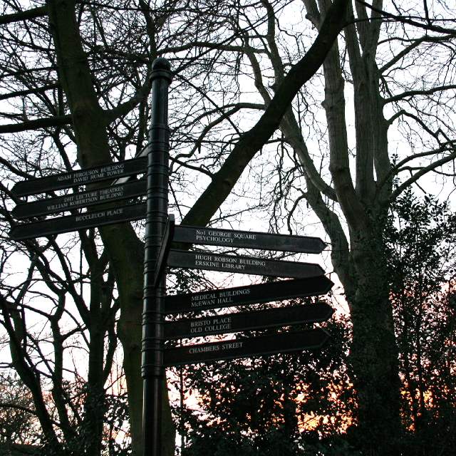
| This image seems excessively jpegd. It's very hard to read the signs as a result. Jpg artifacts are also visible on the darker tree branches. You have some nice colour in the bottom right. I think a little more post processing might have brought that up and improved the interest. 6 |
|
 Photographer found comment helpful. Photographer found comment helpful. |
|
|
02/05/2005 06:35:35 PM |
| It's a little difficult to make out the sign with the silhouettes of the trees behind. |
|
| Photographer found comment helpful. |
|
|
02/03/2005 09:07:43 PM |
| Good picture, little much on the contrast, think it could've done withut the color from the sun on the bottom right. Either a black and white or just waited till the sunset. Still a great picture. |
|
| Photographer found comment helpful. |
|
|
02/03/2005 04:48:15 AM |
The tengled theme comes accross well.
I wish the signs were a little more legible |
|
| Photographer found comment helpful. |
|
|
02/02/2005 03:27:11 PM |
| I think this would look cooler in b/w. The sun at the bottom is very distracting for me |
|
| Photographer found comment helpful. |
|
|
02/02/2005 02:16:37 PM |
| This would have been better if wasn't backlit. The problem here is that the tree sillouhette (did I spell that right?) makes the signs harder to see. |
|
| Photographer found comment helpful. |
|
|
02/02/2005 01:56:52 PM |
| Although (based on your title) you probably wanted the signs to seem tabgled in the trees, they are your subject of the picture! Wish we could at least see the writing a little easier....flash? |
|
| Photographer found comment helpful. |
|
|
02/02/2005 09:22:34 AM |
| A very difficult exposure shot, the signs are just a tad dark. |
|
| Photographer found comment helpful. |
Home -
Challenges -
Community -
League -
Photos -
Cameras -
Lenses -
Learn -
Help -
Terms of Use -
Privacy -
Top ^
DPChallenge, and website content and design, Copyright © 2001-2025 Challenging Technologies, LLC.
All digital photo copyrights belong to the photographers and may not be used without permission.
Current Server Time: 03/12/2025 03:01:12 PM EDT.