| Author | Thread |
|
|
07/12/2005 07:49:07 PM |
| Great subject, but no Wow - it could use a little tweaking. |
|
 Photographer found comment helpful. Photographer found comment helpful. |
|
|
07/12/2005 05:19:45 PM |
B/W Club!
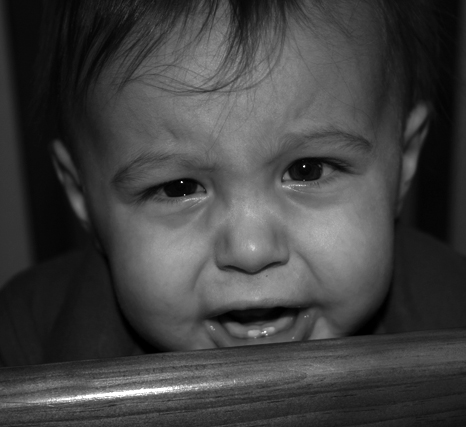
this is a great photo. the full-frame works well, and the focus and composition are dead-on.
like others have said, it is quite dull and gray. i plan to use this as an example for the group because there is a TON of potential here that we can draw out. you'll have a real winner of a print on your hands soon! |
|
| Photographer found comment helpful. |
|
|
07/11/2005 03:13:09 PM |
B/W Mentor Group:
(I'm going to ignore the cute model, composition, dof in favor of B&W aspects) :)
I would agree with Kavey that the shot is overall dark with no punch - no pure black or white. No strong separation of subjects and areas of the photo - gives a blended, cloudy feel. I think this is what leads me to feel no drama or draw to the photo. |
|
| Photographer found comment helpful. |
|
|
07/11/2005 10:48:39 AM |
B/W Mentor Group.
Here are my observations in no particular order:
- Focus is on the wooden pole infront of the child rather than on the child. This is a big point for me and definitely is the one thing thta stands out most strongly.
- Does the pole have significance to the image contents? If not I'd suggest excluding it.
- The image overall is quite dark though you do have some natural highlights so it's not wrongly exposed - I don't know if this darkness is deliberate but it doesn't draw me in - perhaps throwing a touch more light onto the child's face might make it more attention grabbing?
- Eye contact is good - that provides a connection between subject and viewer.
|
|
| Photographer found comment helpful. |
Comments Made During the Challenge  |
|
|
02/14/2005 08:26:39 PM |
| why does it break my heart? i don't see pain here as much as annoyance |
|
|
|
02/11/2005 10:46:34 AM |
|
| Photographer found comment helpful. |
|
|
02/10/2005 12:30:46 PM |
| Like the title. Nice image. A little dark. |
|
| Photographer found comment helpful. |
|
|
02/09/2005 05:58:45 PM |
| Aw...poor kid! Nice pic. Could use a little more focus on the baby and less on the rail. |
|
| Photographer found comment helpful. |
|
|
02/09/2005 01:55:09 PM |
|
| Photographer found comment helpful. |
Home -
Challenges -
Community -
League -
Photos -
Cameras -
Lenses -
Learn -
Help -
Terms of Use -
Privacy -
Top ^
DPChallenge, and website content and design, Copyright © 2001-2025 Challenging Technologies, LLC.
All digital photo copyrights belong to the photographers and may not be used without permission.
Current Server Time: 03/12/2025 10:21:17 PM EDT.