| Author | Thread |
Comments Made During the Challenge  |
|
|
02/22/2005 09:32:37 PM |
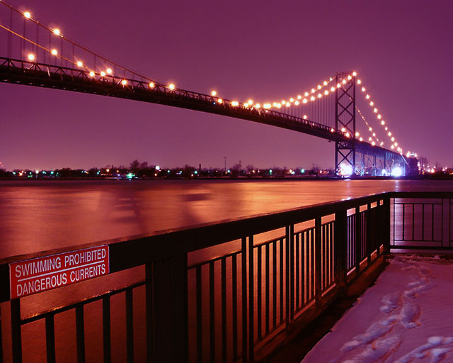
| Like this a lot, but the sign on the left is killing it. |
|
 Photographer found comment helpful. Photographer found comment helpful. |
|
|
02/21/2005 11:20:06 PM |
| The view of the bridge aside, what is really amusing is the inclusion of the swimming prohibited sign, with snow on the ground yet. |
|
| Photographer found comment helpful. |
|
|
02/21/2005 03:45:21 PM |
| There just has to be a good tutorial on how to get lights like these to turn out better. I surely don't know how, but someone must - it would help with this photo and about 9000 of mine! |
|
|
|
02/21/2005 03:16:37 AM |
| I find that the sign on the left draws my eye away from the rest of the picture. |
|
| Photographer found comment helpful. |
|
|
02/20/2005 04:28:36 AM |
| I think I would have rated this one higher, if the focal point was put beyond the end of the deck. I think that would have pulled the focus of the bridge in just a hair to make it really neat. Of course then I might be asking you what the sign said... :) |
|
| Photographer found comment helpful. |
|
|
02/19/2005 06:02:44 PM |
| very nice and clear .. good shot |
|
| Photographer found comment helpful. |
|
|
02/18/2005 06:56:09 PM |
| Nice exposure. I don't know what the sign adds to this picture; to me it's a distraction but maybe you wanted it there so I won't come down on that too hard. And personally I'd like the whole picture moved up a bit, with less on the bottom and more on the top. But this is all nit-picky, overall this is a very nice shot. |
|
| Photographer found comment helpful. |
|
|
02/18/2005 06:33:39 PM |
| The foreground content makes this photo interesting, I like the depth created by it. The sign "swimming prohibited" makes no sense in these conditions and therefore adds some fun. |
|
| Photographer found comment helpful. |
|
|
02/18/2005 06:09:15 PM |
| Personal opinion here, but I might have cropped out the railing, however I think you were trying to include the sign, so it's all okay. |
|
| Photographer found comment helpful. |
|
|
02/18/2005 06:21:18 AM |
| Hm... did you try taking pictures that didn't include the sign? i feel like it's distracting me from the rest of a very pretty image. (7) |
|
| Photographer found comment helpful. |
|
|
02/18/2005 04:24:34 AM |
|
|
|
02/17/2005 08:05:46 AM |
| Very moody... i like the colors and snow... just sign and white lights at back bit distracting. Good job anyway, |
|
| Photographer found comment helpful. |
|
|
02/17/2005 12:36:38 AM |
| this should score high...beautiful color...perfect use of the shutter |
|
| Photographer found comment helpful. |
|
|
02/16/2005 08:34:35 PM |
the sign in the forefront reallly adds interest
the colors are muted, but nice |
|
| Photographer found comment helpful. |
|
|
02/16/2005 07:06:49 PM |
|
| Photographer found comment helpful. |
|
|
02/16/2005 02:42:25 PM |
| Nice colors ! I would have lost the foreground though. 6 |
|
| Photographer found comment helpful. |
|
|
02/16/2005 11:28:46 AM |
|
| Photographer found comment helpful. |
|
|
02/16/2005 10:14:04 AM |
| leaving the sign in is a decision I wouldn't have made. Excellent colors, nice exposure, |
|
| Photographer found comment helpful. |
|
|
02/16/2005 09:36:28 AM |
|
| Photographer found comment helpful. |
|
|
02/16/2005 12:53:10 AM |
| Nice colors blur I dig the sign 8 |
|
| Photographer found comment helpful. |
|
|
02/16/2005 12:27:51 AM |
| Would have been great with out the sign. |
|
| Photographer found comment helpful. |
Home -
Challenges -
Community -
League -
Photos -
Cameras -
Lenses -
Learn -
Help -
Terms of Use -
Privacy -
Top ^
DPChallenge, and website content and design, Copyright © 2001-2025 Challenging Technologies, LLC.
All digital photo copyrights belong to the photographers and may not be used without permission.
Current Server Time: 03/12/2025 01:49:38 AM EDT.