| Author | Thread |
Comments Made During the Challenge  |
|
|
02/22/2005 06:33:02 PM |
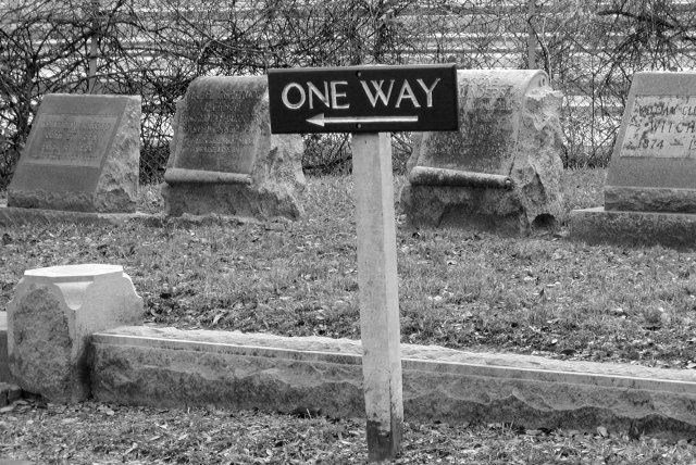
| Creative. One of the few abstract bridges I've seen. |
|
 Photographer found comment helpful. Photographer found comment helpful. |
|
|
02/22/2005 03:23:52 PM |
| Wow. What an ironic sign to put in a cemetary. I think I'd like it better if it was not directly centered. Otherwise, nice job. |
|
| Photographer found comment helpful. |
|
|
02/22/2005 10:02:31 AM |
| Funny! Perhaps a lower f-stop would have added a nice subtle touch to it. |
|
| Photographer found comment helpful. |
|
|
02/21/2005 05:57:38 PM |
| Visually, beyond the joke, it's a little flat. A lot of the background seems like the same shade of gray, probably due to the lighting/time of day? Great observation, though - it made me chuckle - and extra points for not being a "structural" bridge (which is more than I can say for my shot ....). |
|
| Photographer found comment helpful. |
|
|
02/21/2005 12:44:17 PM |
| Maybe this would be a little bit better with the sign nearer the right of the frame, pointing into it? |
|
| Photographer found comment helpful. |
|
|
02/21/2005 11:17:59 AM |
| Very clever - makes one wonder what the arrow's pointing to...... (At least, it's horizontal, not downward) |
|
| Photographer found comment helpful. |
|
|
02/20/2005 07:23:31 PM |
| Different... I Like it. 7 |
|
| Photographer found comment helpful. |
|
|
02/18/2005 02:45:18 PM |
| I like the composition. Title doesn't quite fit for me, although I do "get" what you're going for. Another angle (higher?) might work better, getting rid of what looks like a freeway in the background. Would like to be able to read the stones a little better, too. I'm sounding critical, but I like the shot. |
|
| Photographer found comment helpful. |
|
|
02/16/2005 05:26:10 PM |
| Original concept. I like it. The only thing is the sign is not parallel. My personal preference is either make the sign paralell, or make it even more crooked. |
|
| Photographer found comment helpful. |
|
|
02/16/2005 03:44:07 PM |
| Interesting take on this challenge. I would have liked to see just a tad more contrast, and I think this could have been a bit more appealing if the sign were not quite so centered, but this is a nice picture nonetheless. The textures here are excellent, and the approach is unique. |
|
| Photographer found comment helpful. |
|
|
02/16/2005 01:11:40 PM |
| Interesting take on the challenge. |
|
| Photographer found comment helpful. |
|
|
02/16/2005 12:53:29 PM |
| I like idea but picture doesnt keep interest much. |
|
| Photographer found comment helpful. |
|
|
02/16/2005 09:30:08 AM |
|
| Photographer found comment helpful. |
Home -
Challenges -
Community -
League -
Photos -
Cameras -
Lenses -
Learn -
Help -
Terms of Use -
Privacy -
Top ^
DPChallenge, and website content and design, Copyright © 2001-2025 Challenging Technologies, LLC.
All digital photo copyrights belong to the photographers and may not be used without permission.
Current Server Time: 03/12/2025 02:39:11 PM EDT.