| Author | Thread |
|
|
02/23/2005 02:03:03 AM |
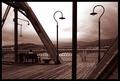
| Thanks for all the helpful comments. The most disappointing thing for me was trying to get the symmetry right. It was difficult to achieve due to the time I had to take the shot in (without getting knocked down by trucks!!). Also the basic editing doesn't allow me to straighten it in Photoshop, so it was left as taken. I went for the most graphic look, high contrast, I thought the white sky quite effective, I was pleased to see so many people apreciated this. I don't agree with Kathy about requiring an angle, that wasn't the point with this image, 'space' is created in other ways here. |
|
Comments Made During the Challenge  |
|
|
02/22/2005 12:07:06 PM |
| Slightly crooked, but well done. Something different from the other shots. You get an extra mark for creativity. 7. |
|
 Photographer found comment helpful. Photographer found comment helpful. |
|
|
02/21/2005 07:30:25 PM |
| Straight up is too static - It needs angle to create space that draws attention. |
|
|
|
02/20/2005 07:24:57 PM |
| I think the contrast of the image is a little harsh, I would try lightening the bridge a little bit, or using a slightly greyer color for the sky. Great idea for the shot. |
|
| Photographer found comment helpful. |
|
|
02/20/2005 04:39:12 AM |
| Clever perspective. I like the variation in light and shade |
|
| Photographer found comment helpful. |
|
|
02/19/2005 01:16:09 PM |
| Great texture and great shades in the upright sections. |
|
| Photographer found comment helpful. |
|
|
02/19/2005 11:57:29 AM |
| Interesting shot. It looks a little lopsided to me - I would like it better if the picture were more even. |
|
| Photographer found comment helpful. |
|
|
02/19/2005 06:08:49 AM |
| Simple, graphic and very powerful. |
|
| Photographer found comment helpful. |
|
|
02/19/2005 04:46:00 AM |
| Very interesting and artistically POV. I think it would of been better if it would of had more symmetry to it. Seems uneven. |
|
| Photographer found comment helpful. |
|
|
02/18/2005 09:43:11 AM |
| I like the perspective! Too bad the sky wasn't blue! |
|
| Photographer found comment helpful. |
|
|
02/17/2005 09:40:36 PM |
|
| Photographer found comment helpful. |
|
|
02/16/2005 10:27:32 PM |
| This is a great shot. The line in the upper left corner is just a little off, but with such a unique take I'm going to ignore. You've got some great depth here. Good luck in the challenge! |
|
| Photographer found comment helpful. |
|
|
02/16/2005 09:21:38 PM |
| Fabulous concept! Love the stone bridge! |
|
| Photographer found comment helpful. |
|
|
02/16/2005 03:49:58 AM |
| Original! Works for me :) |
|
| Photographer found comment helpful. |
|
|
02/16/2005 03:30:50 AM |
| I love this. The angle is excellent - although the subject is identifiable, the unique view gives it an abstract feel that really appeals to me. The focus is great, and the white (sky?) really seems to work here. Beautiful work. |
|
| Photographer found comment helpful. |
|
|
02/16/2005 12:42:34 AM |
|
| Photographer found comment helpful. |
|
|
02/16/2005 12:34:27 AM |
| A nice idea, a bit more symmetry on the top right and left corners would make for a more powerful image imho |
|
| Photographer found comment helpful. |
Home -
Challenges -
Community -
League -
Photos -
Cameras -
Lenses -
Learn -
Help -
Terms of Use -
Privacy -
Top ^
DPChallenge, and website content and design, Copyright © 2001-2025 Challenging Technologies, LLC.
All digital photo copyrights belong to the photographers and may not be used without permission.
Current Server Time: 04/27/2025 06:55:59 PM EDT.