| Author | Thread |
|
|
03/14/2005 04:46:13 AM |
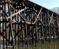
Actually I would have liked the title "two bridges" - it's a clever play on the challenge title and it describes the image.
This is an excellently chosen scene. Well framed at the top and with good, interesting subjects for the eye to land on. I find my eye going back and forth between the two bridges.
There is a colour problem with this image, There's a clear red/brown cast to all the midtones and it's just visible in some of the sky highlights. And again there's a grainy lack of detail that I'm starting to suspect is down to your camera. |
|
 Photographer found comment helpful. Photographer found comment helpful. |
Comments Made During the Challenge  |
|
|
02/21/2005 04:47:37 AM |
| A very dreamy look to this. I'd maybe like to see this a little brighter. |
|
| Photographer found comment helpful. |
|
|
02/20/2005 04:27:43 PM |
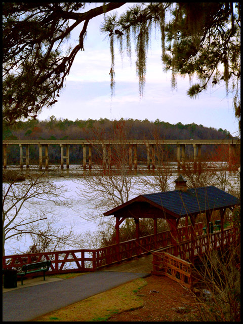
| Lovely composition, but the contrast is just too wide for my poor crt to handle. If you could spot edit to get more detail in the shadows while getting detail in the highlights it would jump 2 or 3 points. I love the old/new comparision |
|
| Photographer found comment helpful. |
|
|
02/18/2005 04:50:07 PM |
| Fantastic composition, I really like how you've framed these two bridges. Focus could be a little sharper, but it's not bad, however the one thing that's holding this image back is the color. Looks as if the saturation has been pushed too far. If you can resolve the color issue I think you might have great photo here. Good luck |
|
| Photographer found comment helpful. |
|
|
02/18/2005 04:08:20 PM |
| The more modern bridge really spoils a great view. I like the vertical crop, bringing in the tree limb. Works really well with the covered bridge. Focusing on the smaller bridge, blurring the background would help a lot, I think. |
|
| Photographer found comment helpful. |
|
|
02/18/2005 07:51:30 AM |
| It seems just a little too dark. I like the framing of the shot. Still work a 7 from me. |
|
| Photographer found comment helpful. |
|
|
02/17/2005 12:39:12 PM |
| Good picture, I think a lighter colour border would've complimented the scenery better. |
|
| Photographer found comment helpful. |
|
|
02/17/2005 12:16:41 AM |
| Wonderful composition that lends an enchantment. The colors appear off and too deeply "contrasty" and the wrong hues. Could be a monitor issue. |
|
| Photographer found comment helpful. |
Home -
Challenges -
Community -
League -
Photos -
Cameras -
Lenses -
Learn -
Help -
Terms of Use -
Privacy -
Top ^
DPChallenge, and website content and design, Copyright © 2001-2025 Challenging Technologies, LLC.
All digital photo copyrights belong to the photographers and may not be used without permission.
Current Server Time: 03/12/2025 04:14:24 PM EDT.