| Author | Thread |
|
|
03/27/2003 07:59:59 PM |
Greetings from the Critique Club :)
Hi Bncrazy...
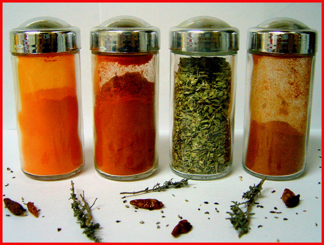
I really like this composition... Spices.. vibrant color... some amount of randomness to the environment... I can 'smell' what I see in this photo.
The lighting on this photo is pretty good. I don't think you could improve it very much, but possibly just a little longer exposure would saturate the white area just a tiny bit more. I believe this would punch up the visual impact just a bit. I wouldn't want the surroundings completely white at all, but just a tad brighter would suit my taste a little better overall.
Another idea that could possibly create a nice composition here would be to put one of the two center bottles on its side with the lid off and let some of the contents spill into the foreground. This would help upset the balance a little more and it would also give a good strong focal point in the image. As this image is presented, it has multiple subjects and doesn't really have a single strong resting place for the eye.
Keep up the good work :)
John Setzler
|
|
Comments Made During the Challenge  |
|
|
03/23/2003 02:12:28 PM |
| Excellent colors and details! I would have bumped this up by a point if the foreground had been in perfect focus. |
|
 Photographer found comment helpful. Photographer found comment helpful. |
|
|
03/19/2003 07:28:14 AM |
| Heh, is that you in the chrome? I would have liked this better if there weren't those spices flounced around on the front there. nice colours. The border is a bit distracting. |
|
| Photographer found comment helpful. |
|
|
03/18/2003 11:17:59 AM |
| Nice set up. It is well cropped and the way the outside glasses seem to be leaning outwards gives this image a nice effect. |
|
| Photographer found comment helpful. |
|
|
03/17/2003 11:34:03 PM |
Oh, very nice colour here. Nice visual impact also.
Very good lighting. The red border also suits this photograph.
Very orginal and I like the composition of the shot.
Certainly meets the Challenge. |
|
| Photographer found comment helpful. |
|
|
03/17/2003 05:31:44 PM |
| Nice idea but the lighting isn't very good. And the items in front of the jars are out of focus. You should have also put more of "it" in front of the jars because right now it looks more like a "mess" that someone didn't clean up rather then being part of the picture. Good idea however. |
|
| Photographer found comment helpful. |
|
|
03/17/2003 04:57:14 PM |
| Nice idea. Would have considered having the subjects be cleaner (simpler). |
|
| Photographer found comment helpful. |
|
|
03/17/2003 12:03:33 PM |
| I like the jars, the stuff in the front looks contrived - 8 |
|
| Photographer found comment helpful. |
|
|
03/17/2003 10:57:56 AM |
| A little blurry, but nice colors |
|
| Photographer found comment helpful. |
Home -
Challenges -
Community -
League -
Photos -
Cameras -
Lenses -
Learn -
Help -
Terms of Use -
Privacy -
Top ^
DPChallenge, and website content and design, Copyright © 2001-2025 Challenging Technologies, LLC.
All digital photo copyrights belong to the photographers and may not be used without permission.
Current Server Time: 03/12/2025 02:55:20 AM EDT.