| Author | Thread |
Comments Made During the Challenge  |
|
|
02/27/2005 02:42:09 AM |
| I tyhink the subject is worn thin, but nice juxposition. |
|
 Photographer found comment helpful. Photographer found comment helpful. |
|
|
02/26/2005 10:33:00 PM |
| Funny idea, but too many distracting and irrelavant background elements. |
|
| Photographer found comment helpful. |
|
|
02/25/2005 05:18:39 PM |
| I like this picture in the fact I don't have to read the title to know what the picture is about. Good job in meeting the challenge. |
|
| Photographer found comment helpful. |
|
|
02/25/2005 05:30:56 AM |
Wonderful juxtaposition :)
|
|
| Photographer found comment helpful. |
|
|
02/24/2005 08:53:10 AM |
|
| Photographer found comment helpful. |
|
|
02/21/2005 10:29:50 PM |
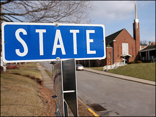
| Two dimensionally the sign is plastered right over the church. It does not imply separation, but rather dominance of the state over the church. A good theme separation of the two, but this composition does not say that to me. Some separation between the two in two dimensions would have spoken more to me about separation. Also when two objects share the "lime light" so to speak they should opppose each other somehow in the frame, these vie for the same spot and attention and it gets in the way of a good photo. |
|
| Photographer found comment helpful. |
|
|
02/21/2005 12:50:59 PM |
| I would have liked a deeper depth of field so the church was brought into focus too.. good luck |
|
|
|
02/21/2005 12:15:53 PM |
| The state is overwhelming to really the meaning of the church. |
|
|
|
02/21/2005 03:53:15 AM |
| would have been great for the Road sign challenge...but you already knew that...lol |
|
| Photographer found comment helpful. |
Home -
Challenges -
Community -
League -
Photos -
Cameras -
Lenses -
Learn -
Help -
Terms of Use -
Privacy -
Top ^
DPChallenge, and website content and design, Copyright © 2001-2025 Challenging Technologies, LLC.
All digital photo copyrights belong to the photographers and may not be used without permission.
Current Server Time: 03/13/2025 06:33:07 AM EDT.