| Author | Thread |
Comments Made During the Challenge  |
|
|
05/12/2002 07:03:00 PM |
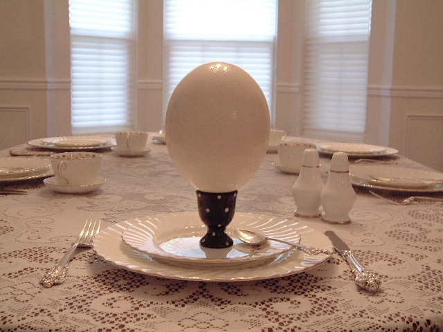
| this is egg-straordinary: egg-ceptional lighting: egg-cellent idea - ;) |
|
|
|
05/12/2002 05:27:00 PM |
| good pic and DOF. Hard to tell what you might be selling, so it leaves an empty spot for me. |
|
|
|
05/12/2002 11:12:00 AM |
| Good setup, the color is nice throughout the whole image. That's quite the giant egg. |
|
|
|
05/11/2002 05:15:00 PM |
| Wow, I really like it. Was there a way to get all three sets of shades to match? The top half of the right one is distracting. |
|
|
|
05/10/2002 06:12:00 PM |
| Just. Pure. Sweetness. If only it wasn't a BIT tilted! |
|
|
|
05/10/2002 05:16:00 PM |
| not hard to guess what is advertised here-----I would have perfered a different backgroound myself but I sure do like the colors------10 |
|
|
|
05/10/2002 04:52:00 PM |
| Very nice composure. I like the high key look to it. Not having any vibrant colors for contrast really makes it look that much more artisitc. Who or what laid it?? |
|
|
|
05/10/2002 02:10:00 PM |
| Funny, and a tricky lighting problem. |
|
|
|
05/10/2002 10:52:00 AM |
| Nice shot, I dont know if I would attempt to eat something that big but still a nice shot. |
|
|
|
05/10/2002 12:38:00 AM |
| That's one big egg. I think a hgher, more level camera position would have helped the composition. My eyes get pulled away from the foreground, and I can't remember the last time I saw a table setting from this low a perspective. The glare from the window caused the interior to underexpose a little, and you got some noise on the egg and in the walls as a result. |
|
|
|
05/09/2002 10:34:00 PM |
| Now, that's a big egg! I like the use of white and the black stand. The photo seems to be a little bit tipped to the right. |
|
|
|
05/09/2002 05:13:00 PM |
| i like the simplicity, the symmetry, and the colors, i wish to heck the horizon line was level, it's off just enough to be disturbing, and not enough to look intentional :) |
|
|
|
05/09/2002 02:43:00 PM |
| What kind of egg is that supposed to be? This is a very elegant setup. |
|
|
|
05/09/2002 12:12:00 PM |
| good lord, why are you hiding the ostriches |
|
|
|
05/09/2002 07:11:00 AM |
| Heck, this looks like it could be for lunch and supper, too! On one hand, I kinda like all the light colors, but that makes the egg holder almost become the focal point of the picture. I assume you were wanting the egg to be that. Maybe if it had some more colors in it somewhere (the picture, not the egg). |
|
|
|
05/07/2002 11:18:00 PM |
| The ISO on this shot seems a little high -- the photo is slightly grainy. This seems pretty important, since the smoothness of the egg is lost. |
|
|
|
05/07/2002 09:07:00 PM |
| I enjoyed the humor of this photo. That's a BIG egg. Made me look twice. Most excellent. I like the composition. I think the choice to go with whites and not make the egg really stand out was a good choice. |
|
|
|
05/07/2002 08:58:00 PM |
| I love the composition. I think it would have made a great shot if the colors were more natural. It appears that the white balance may be off? Nice effort. |
|
|
|
05/07/2002 08:49:00 PM |
| I love all the whites, and the HUGE egg. Just a tiny bit dark, but otherwise very good. I like the focus. |
|
|
|
05/07/2002 02:03:00 PM |
| In terms of centering, lighting and concept, I like it. |
|
|
|
05/07/2002 12:31:00 PM |
| This photo is so beautifully set up and photographed. I love it, especially the light filtering through the blinds in the background. |
|
|
|
05/07/2002 06:43:00 AM |
| too much white in the pic, not enough contrast but nice pic and idea |
|
|
|
05/07/2002 01:42:00 AM |
| beautiful table, scary egg! |
|
|
|
05/06/2002 11:36:00 PM |
Simple, elegant and the extra big egg sets the ad apart.
Well photographed too. Nice job. |
|
|
|
05/06/2002 03:07:00 PM |
| I like mine scrambled and i guess i'll only need ONE... :) Good job! |
|
|
|
05/06/2002 02:10:00 PM |
|
|
|
05/06/2002 01:30:00 PM |
| A little contrast might have been nice, it's soooo white! Photo 9 Advert 9 Creativity 8 total 9 |
|
|
|
05/06/2002 09:45:00 AM |
| Cute title here, needs more contrast. |
|
|
|
05/06/2002 07:09:00 AM |
| GREAT PHOTO...I LOOK FORWARD TO YOUR NEXT ENTRY |
|
|
|
05/06/2002 05:37:00 AM |
| GREAT DOP. Great everything. I love this unique idea ! |
|
|
|
05/06/2002 05:01:00 AM |
| nice use of the color white. |
|
|
|
05/06/2002 02:09:00 AM |
| What in crist sakey is that? |
|
|
|
05/06/2002 12:58:00 AM |
| hahaha, that's hilarious.. |
|
|
|
05/06/2002 04:01:00 PM |
| goodness - you'd need an axe for this baby!, great control of lighting and colour blending. |
|
|
|
05/06/2002 03:30:00 PM |
| This is funny! And I like your silverware. too! Nice monochromatic theme: EGGSHELL! Nice job. |
|
Home -
Challenges -
Community -
League -
Photos -
Cameras -
Lenses -
Learn -
Help -
Terms of Use -
Privacy -
Top ^
DPChallenge, and website content and design, Copyright © 2001-2025 Challenging Technologies, LLC.
All digital photo copyrights belong to the photographers and may not be used without permission.
Current Server Time: 03/14/2025 05:58:29 AM EDT.