| Author | Thread |
Comments Made During the Challenge  |
|
|
03/01/2005 02:27:31 PM |
| hey I am 16, it looks like a picture I would probably take. I mean you could do better |
|
|
|
02/27/2005 07:25:35 AM |
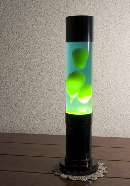
| This isn't a bad photo, but I don't get a 1970s feel from the image. |
|
 Photographer found comment helpful. Photographer found comment helpful. |
|
|
02/26/2005 01:52:52 AM |
| Background and setting is just too blah. Sorry. |
|
| Photographer found comment helpful. |
|
|
02/24/2005 08:21:12 AM |
| the wall and table and doily texture take away from the image, and distract the eye.. A plain background might have drawn your eye better. Nice job though. |
|
| Photographer found comment helpful. |
|
|
02/24/2005 06:05:52 AM |
| My first impression was why that background but the more I thought about it the more I remember having that stuff all through the house hehe.. |
|
|
|
02/23/2005 02:25:22 PM |
| Hot spot on right side of glass is distracting... perhaps could have blocked direct sun. Also, I'm not a fan of the doily. |
|
|
|
02/23/2005 12:49:10 PM |
| Good idea, composition with diferent lights could imrpove this one. |
|
| Photographer found comment helpful. |
Home -
Challenges -
Community -
League -
Photos -
Cameras -
Lenses -
Learn -
Help -
Terms of Use -
Privacy -
Top ^
DPChallenge, and website content and design, Copyright © 2001-2025 Challenging Technologies, LLC.
All digital photo copyrights belong to the photographers and may not be used without permission.
Current Server Time: 03/12/2025 09:38:13 PM EDT.