| Author | Thread |
Comments Made During the Challenge  |
|
|
03/01/2005 10:13:28 PM |
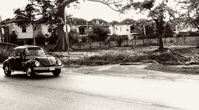
| I like the grainy look. If I didn't know any better I would think this was taken in the 70's. |
|
 Photographer found comment helpful. Photographer found comment helpful. |
|
|
02/27/2005 12:08:03 AM |
| I know what kind of photo you were going for, few things might help..exposure and level your photo seems a little unlevel to me. The houses seem to run up and the ground looks flat. Just my thoughts |
|
| Photographer found comment helpful. |
|
|
02/26/2005 06:20:07 PM |
|
| Photographer found comment helpful. |
|
|
02/26/2005 03:35:51 PM |
|
| Photographer found comment helpful. |
|
|
02/26/2005 02:49:54 PM |
| Nice documentary feel, as if actually taken in the 70's. |
|
| Photographer found comment helpful. |
|
|
02/26/2005 12:17:51 PM |
| Where's your time machine?!!! This IS the 70s!! Nice job. |
|
| Photographer found comment helpful. |
|
|
02/25/2005 03:03:04 PM |
oh yeah we all are man......nothing ever dies in a bug and if it does we fix it and keep going.....
looks like a well main tained 1971 any way great shot love the grain and the aged affect could have done it any better.
GL 10 |
|
| Photographer found comment helpful. |
|
|
02/25/2005 06:49:40 AM |
| is it a photo of a photo? |
|
|
|
02/24/2005 05:58:00 PM |
| This is a good shot. Love the grain, very retro..maybe more 50's than 70's with the black and white..but whatever, good work (it's a bit tilted though).7 |
|
| Photographer found comment helpful. |
|
|
02/24/2005 04:12:17 PM |
|
| Photographer found comment helpful. |
|
|
02/24/2005 01:28:47 PM |
| the houses in the background are a little too distracting, I think all of the noise really adds a lot to the picture. The only thing I would do different is to make the car stand out more, all the other stuff around it (trees and houses) are a little distracting. |
|
| Photographer found comment helpful. |
|
|
02/24/2005 11:30:18 AM |
| Nice! Love the tones and offset subject, the only "bug" I could find to shoot was a small toy one so I didn't do it. Good job |
|
| Photographer found comment helpful. |
|
|
02/24/2005 11:22:10 AM |
| Nicely processed. I would like it a little more if the horizon was level and the car was a little farther into the frame. Beats the heck out of all the pictures of vinyl cover art :-) (7) |
|
| Photographer found comment helpful. |
|
|
02/24/2005 09:40:39 AM |
|
| Photographer found comment helpful. |
|
|
02/23/2005 11:07:50 PM |
| not enough of the subject. 5 |
|
| Photographer found comment helpful. |
|
|
02/23/2005 05:15:42 PM |
| maybe it's just personal preferrence but i think the bug would have more emphasis if it was closer to the rule of thirds verticals. like about where that stop sign is. |
|
| Photographer found comment helpful. |
|
|
02/23/2005 03:05:04 PM |
| Well done. I'm assuming the grain is intentional. |
|
| Photographer found comment helpful. |
|
|
02/23/2005 02:54:46 PM |
Good one. Really looks like it comes out of the seventies.
The horizon should be level though.
|
|
| Photographer found comment helpful. |
|
|
02/23/2005 01:23:36 PM |
| The tone (greyness) really makes this picture. |
|
| Photographer found comment helpful. |
|
|
02/23/2005 01:13:56 PM |
| Looks like it was taken in the 70's. Nice job editing it. |
|
| Photographer found comment helpful. |
|
|
02/23/2005 09:05:36 AM |
| classis bug...like it but would have cropped off the right side a bit |
|
| Photographer found comment helpful. |
|
|
02/23/2005 04:09:07 AM |
| Great car, love the grain. |
|
| Photographer found comment helpful. |
|
|
02/23/2005 12:42:21 AM |
| I like the b/w choice here, fits the challenge as well as suits this image perfectly. Do you think that the image could have been rotated right by 1 deg? Those houses look crooked. |
|
| Photographer found comment helpful. |
Home -
Challenges -
Community -
League -
Photos -
Cameras -
Lenses -
Learn -
Help -
Terms of Use -
Privacy -
Top ^
DPChallenge, and website content and design, Copyright © 2001-2025 Challenging Technologies, LLC.
All digital photo copyrights belong to the photographers and may not be used without permission.
Current Server Time: 03/16/2025 01:48:21 AM EDT.