| Author | Thread |
|
|
03/21/2003 11:18:36 AM |
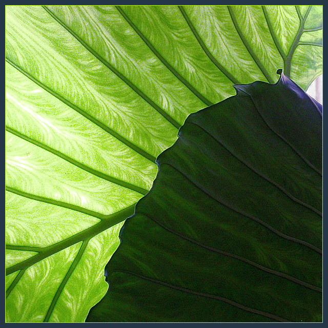
| great shot...the lighter green leaf is amazing! i like the darker area as it seems to add an abstract quality to the photo. the only change i would make is to crop out the non-green area on the right. |
|
|
|
03/21/2003 12:16:00 AM |
| This was my top shot. Should have ranked higher. I enjoy your images so much. |
|
Comments Made During the Challenge  |
|
|
03/20/2003 10:12:15 PM |
| I found the veining of the translucent leaf very intresting and the darker area overwhelms the delicacy of the lighter leaf. maybe if the contrast were a bit more subtle it would have worked better. I have been cropping out the white light on the right..this is odd but this looks so much better on my laptop screen than on my desktop at work |
|
|
|
03/19/2003 07:50:53 PM |
Composition is good; Photograph meets the Challenge; Visual impact is good; Focus is good; Shows good idea and originality; Colour of photograph is good.
Why didn't you crop out the upper right hand corner where the light shines through? |
|
 Photographer found comment helpful. Photographer found comment helpful. |
|
|
03/19/2003 01:50:45 PM |
I think the dark leaf spoils this a bit, the light leaf is absolutely gorgeous and I want to see more of it.
A good shot that would have scored better if it was just the back leaf. |
|
|
|
03/18/2003 11:16:35 PM |
| Very cool, the colors and lighting of the leaves is FANTASTIC!! And the darker leaf on the right really makes this picture GREAT! 9. This one may win. :) |
|
|
|
03/18/2003 07:36:27 PM |
| Isn't that beautiful! It looks like velvet drapery. I like the little bit of grain, it adds an interesting appeal. I also like that your leaf covers almost all of the frame with one, tiny little exception. I also like the contrast of very light and very dark. This is a really nice image. |
|
|
|
03/18/2003 07:26:27 AM |
| Nice shot. I would although have avoided the white area in the upper right corner. It distract a lot from the patter/texture and ver nice contrast between the greens.6. Lionel |
|
| Photographer found comment helpful. |
|
|
03/18/2003 04:00:14 AM |
| Nice abstraction. Appears a little grainy in some areas and it would have been better to omit the "non-green" area on the right. Still, very nice image. |
|
| Photographer found comment helpful. |
|
|
03/18/2003 12:57:54 AM |
| I really like the very bright and very dark. Tone is handled very well. Good job. My top choice. Soft focus works well. |
|
Home -
Challenges -
Community -
League -
Photos -
Cameras -
Lenses -
Learn -
Help -
Terms of Use -
Privacy -
Top ^
DPChallenge, and website content and design, Copyright © 2001-2025 Challenging Technologies, LLC.
All digital photo copyrights belong to the photographers and may not be used without permission.
Current Server Time: 03/12/2025 01:18:16 AM EDT.