ok, i am voting this challenge in 2 passes. in this pass, you will get a partial comment and a score. then i will come back to comment again. if you have any problem whatsoever with this comment, pm me and let me know. otherwise, take it with a grain of salt...i'm not trying to be a know-it-all, i'm just explaining where i'm coming from in voting this challenge. and, if this comment is NOT helpful (of if you think i'm full of $#!+), don't mark it helpful.
billboards are a science unto themselves. a lot of research has gone into determining just how much information a person can digest and retain in specific time spans. they use this information to develop formulas for determining the number of words and letters to use on billboards, as well as their sizes. they also determine the size and number of visual elements to include.
the graphics/photograph on a billboard are designed to get the point across in a moment. on the road, a driver will have less time with a billboard than a voter will give your image. this is a key element in the challenge: composing a shot that will get its point across quickly and succintly. along those lines, a strong composition will probably have few details and make strong use of negative space.
-------------------
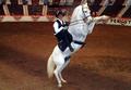
ok, you have a picture with a fox in the distance...interesting idea for a billboard, but i think the composition isn't quite working for a billboard. there's not much room in the image to tie the image to the idea, and at 60 mph, i don't think that fox would be too noticeable...
------------------
here's a couple more things to consider:
this image is also a great place to start figuring out what dpc is really all about. there are two things going on: improving your photography, and, if you want, learning how to compete in these challenges. these are not necessary the same thing, as evidenced by the number of great photographs and photographers that do not win ribbons.
as for competing in challenges... challenges are what makes this sight unique in that everybody has to start from scratch, as opposed to raking their archives for a 'best of' type picture. as you peruse the archives, you can see the differences between the top 20% and the bottom 20% very easily. one of the biggest differences between the two is that the bottom ones nearly always come across as images snapped quickly in hopes of 'meeting the challenge'. it is very rare that images that are not thought out and worked out in advance do that well. yes, some people have the equipment to do things that the rest of us can't, but that doesn't mean we can't compensate by excercising our imaginations and pushing our skills.
well, you've paid for a membership. i hope you use it to your full advantage. dpc has helped my photography tremendously, but it hasn't been without its bumps and bruises. i hope that it will help you get where you want to be, as well. good luck! |