ok, i am voting this challenge in 2 passes. in this pass, you will get a partial comment and a score. then i will come back to comment again. if you have any problem whatsoever with this comment, pm me and let me know. otherwise, take it with a grain of salt...i'm not trying to be a know-it-all, i'm just explaining where i'm coming from in voting this challenge. and, if this comment is NOT helpful (of if you think i'm full of $#!+), don't mark it helpful.
billboards are a science unto themselves. a lot of research has gone into determining just how much information a person can digest and retain in specific time spans. they use this information to develop formulas for determining the number of words and letters to use on billboards, as well as their sizes. they also determine the size and number of visual elements to include.
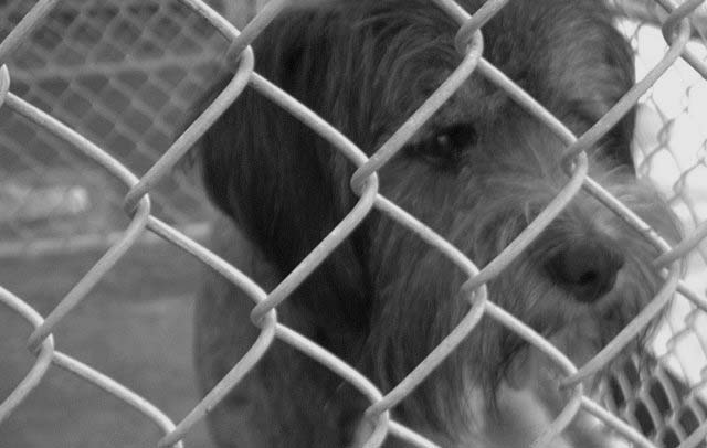
the graphics/photograph on a billboard are designed to get the point across in a moment. on the road, a driver will have less time with a billboard than a voter will give your image. this is a key element in the challenge: composing a shot that will get its point across quickly and succintly. along those lines, a strong composition will probably have few details and make strong use of negative space.
---------------
this is a nice idea for a billboard and a very true cause (all four of our pets were rescued). as an advertising image, though, i think this would be more effective in a print ad than on a billboard, as the soft focus and short dof make it hard to quickly see the whole image in a short glance. this would have to be placed somewhere where the viewer would have ample time to take the image in, which is a bit contrary to what billboards are designed to do. i hope you haven't been beaten up to much by the size police, but the challenge description is something to consider when preparing to take your shots. good luck! |