| Author | Thread |
|
|
06/09/2007 02:55:51 PM |
| STRIKING! The pure white is so startling. Awesome image! |
|
 Photographer found comment helpful. Photographer found comment helpful. |
Comments Made During the Challenge  |
|
|
03/08/2005 07:19:50 PM |
| Very nice one of my favorities of this challenge |
|
| Photographer found comment helpful. |
|
|
03/08/2005 06:12:43 PM |
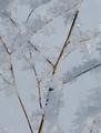
i think this would have been a great shot if it wasn't soo... white! the foreground has lost all definition, , and looks a little too stark for my liking.
Message edited by author 2005-03-09 22:53:30. |
|
| Photographer found comment helpful. |
|
|
03/07/2005 11:05:52 PM |
| This is a beautiful picture, with a great use of unusual processing. I really don't think it fits the challenge, though--the background is definitely white, but the foreground/subject is all very dark and mostly black. (6) |
|
| Photographer found comment helpful. |
|
|
03/07/2005 05:23:38 PM |
| Very good photo. Should make it in top 3. Best of luck. |
|
| Photographer found comment helpful. |
|
|
03/07/2005 02:38:20 PM |
| WOW everything is WHITE :) |
|
| Photographer found comment helpful. |
|
|
03/06/2005 05:07:00 PM |
|
| Photographer found comment helpful. |
|
|
03/05/2005 10:47:23 PM |
|
| Photographer found comment helpful. |
|
|
03/05/2005 01:25:17 PM |
|
| Photographer found comment helpful. |
|
|
03/04/2005 01:03:15 PM |
|
| Photographer found comment helpful. |
|
|
03/04/2005 11:09:49 AM |
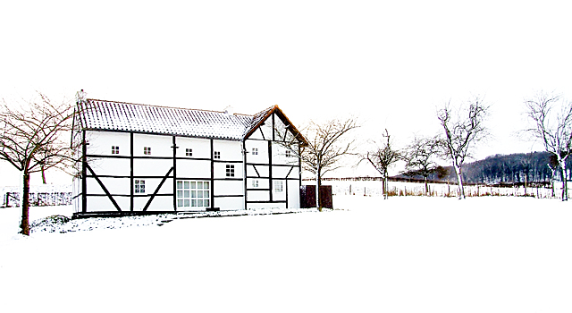
Challenge: 7 from reading the challenge I was needing something of a different color against a white background giving a high-key effect. I still like your shot very nicely done.
Techincal: 9 definetly a good high key shot I love the various lines and the house I think its a house big house but very nice.
Composition: 8 I would have took the shot more of the house and the 2 main trees and left the right side out or croped to that image area.
Appeal: 7 just not giving the pop or wow smacking my eyes.
Overall: 8 |
|
| Photographer found comment helpful. |
|
|
03/03/2005 07:40:33 AM |
| Real nice... would look good as print. Just they say better is not to put horizon in middle...should lower or pull up to look more interesting. |
|
| Photographer found comment helpful. |
|
|
03/03/2005 01:09:41 AM |
| yikes... did you turn up the contrast? |
|
| Photographer found comment helpful. |
|
|
03/02/2005 02:56:22 AM |
|
| Photographer found comment helpful. |
|
|
03/02/2005 01:51:25 AM |
| I love this shot,,, but I do find the bushes at the right hand side very distracting. A very nice pic nonethelesss. |
|
| Photographer found comment helpful. |
Home -
Challenges -
Community -
League -
Photos -
Cameras -
Lenses -
Learn -
Help -
Terms of Use -
Privacy -
Top ^
DPChallenge, and website content and design, Copyright © 2001-2025 Challenging Technologies, LLC.
All digital photo copyrights belong to the photographers and may not be used without permission.
Current Server Time: 03/12/2025 05:58:20 PM EDT.