From the critique club:
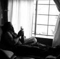
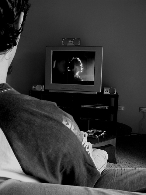
First, in looking over this image I see nothing technically wrong in the concept nor in the execution. The choice for b/w was good and the composition is not offensive. The low score, below 5, is surprising to me. Of course, several things can be done to improve the delivery. The desire here was to show the entire toy creating a spatial impasse between subject and screen. let us proceed to make this more in your face of an image.
The first thing we do is we do away with table and even the support system. yes, it is very neat and attractive but think: you want to create an impression and so we bring the screen closer. How close?
Well, say close enough that it will start partially hid by your face and then going across the entire image. This puts it in an unreal proximity to your face but the viewers will not discern the distance. Now, we change the lighting a little so that the screen serves as backlight on your head. That is, we move the main light higher so as to leave your shirt less lit.
Of course, easy for me to say, I have given you a different image, but when shooting these ideas always remember to include such variations. Once the viewer sees the image he wants to be grabbed at once. With such concepts, closer is always better.
Since you are just starting I would not dwell too much on these early attempts. First you need to experiment and find your forte. As far as technique you are on the right path. It is the presentation angle that you need to tackle and this means that you must try and succeed in visualizing the finish product before you click the shutter. Even when you feel you have it, great, file it and go on to the next variation. You will be amazed at what gems are born out of variations. Keep up the good work. |