| Author | Thread |
Comments Made During the Challenge  |
|
|
03/04/2005 11:27:35 PM |
| Nice concept could have used better lighting |
|
|
|
03/04/2005 08:44:36 PM |
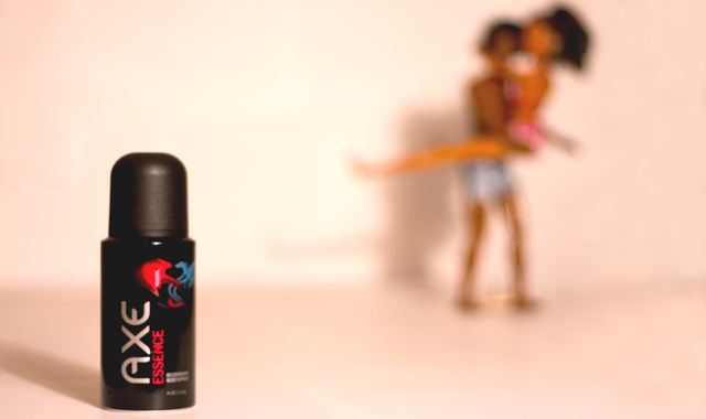
| This would be so much more believeable and better with real people rather than dolls. But ti's a strong idea and composed well. Lighting needs a bit more work, but overall an OK job. :o) |
|
|
|
03/04/2005 04:43:29 PM |
| Nice idea, better lighting would make this stand out |
|
|
|
03/04/2005 03:59:30 PM |
| good idea, but the sprey can shut have been bigger. |
|
|
|
03/01/2005 10:13:02 PM |
| nice...are those barbies? |
|
|
|
03/01/2005 07:56:26 PM |
|
|
|
03/01/2005 02:26:31 PM |
|
|
|
03/01/2005 09:35:58 AM |
| Team America actors posing for Axe! I love it. |
|
|
|
03/01/2005 06:34:22 AM |
| Simple and funny. This is what makes the image eye-catching. |
|
|
|
02/28/2005 08:18:21 PM |
| very humorous... never get approved for display in the US, haha! ;) |
|
|
|
02/28/2005 07:47:25 PM |
ok, i am voting this challenge in 2 passes. in this pass, you will get a partial comment and a score. then i will come back to comment again. if you have any problem whatsoever with this comment, pm me and let me know. otherwise, take it with a grain of salt...i'm not trying to be a know-it-all, i'm just explaining where i'm coming from in voting this challenge. and, if this comment is NOT helpful (of if you think i'm full of $#!+), don't mark it helpful.
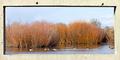
billboards are a science unto themselves. a lot of research has gone into determining just how much information a person can digest and retain in specific time spans. they use this information to develop formulas for determining the number of words and letters to use on billboards, as well as their sizes. they also determine the size and number of visual elements to include.
the graphics/photograph on a billboard are designed to get the point across in a moment. on the road, a driver will have less time with a billboard than a voter will give your image. this is a key element in the challenge: composing a shot that will get its point across quickly and succintly. along those lines, a strong composition will probably have few details and make strong use of negative space. |
|
|
|
02/28/2005 04:53:04 PM |
|
|
|
02/28/2005 01:43:38 PM |
|
|
|
02/28/2005 01:41:27 PM |
hehe, this made me laugh :)
Too bad you didn't use real models, but I know we don't all have that luxury (I know I don't). Lighting could have been a bit better, as this seems too dark. Adjusting the curves (in photoshop) may have helped.
Points for humour and originality :) |
|
|
|
02/28/2005 01:17:16 PM |
|
|
|
02/28/2005 12:15:12 PM |
| Cute idea. Make the focus a little less soft. |
|
|
|
02/28/2005 09:26:48 AM |
|
|
|
02/28/2005 09:21:41 AM |
| I made a similar comment to another Bokeh in this challenge - it is more fit for the magazine ads, does not fit the billboard signs. |
|
|
|
02/28/2005 01:41:56 AM |
| LOL.....almost too much, but I got a chuckle! |
|
Home -
Challenges -
Community -
League -
Photos -
Cameras -
Lenses -
Learn -
Help -
Terms of Use -
Privacy -
Top ^
DPChallenge, and website content and design, Copyright © 2001-2025 Challenging Technologies, LLC.
All digital photo copyrights belong to the photographers and may not be used without permission.
Current Server Time: 03/12/2025 03:25:05 PM EDT.