| Author | Thread |
|
|
03/05/2005 03:39:51 AM |
| Thanks Damon, it's a picture I printed and attached :) |
|
|
|
03/05/2005 02:23:31 AM |
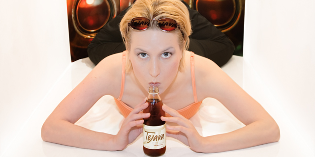
Wow, I just noticed the reflections (?) in the sunglasses. How did you do that? Did you attach acetates to the lenses? Nice touch.
|
|
 Photographer found comment helpful. Photographer found comment helpful. |
|
|
03/05/2005 12:35:49 AM |
| Thank you for all the uplifting comments, I am very happy w a +6 score here.. knowing it could be improved by alot :) |
|
|
|
03/05/2005 12:07:42 AM |
| Nice finish, sonda. And great image. |
|
| Photographer found comment helpful. |
Comments Made During the Challenge  |
|
|
03/04/2005 11:25:54 PM |
| Talk about a picture saying a thousand words. Great advertising piece |
|
| Photographer found comment helpful. |
|
|
03/04/2005 10:38:57 PM |
|
| Photographer found comment helpful. |
|
|
03/04/2005 08:51:10 PM |
| This is a really nice setup and a good concept for a billboard. I think the shot is just a little bit bright and would probably look better if there were more to look at in the white spaces on the sides, but it's still an excellent photo for this challenge. Nice job! |
|
| Photographer found comment helpful. |
|
|
03/04/2005 07:51:40 PM |
| I think of all the images in the challenge, this one most looks like a billboard to me. A very beautiful one! 10. |
|
| Photographer found comment helpful. |
|
|
02/28/2005 09:26:46 PM |
ok, i am voting this challenge in 2 passes. in this pass, you will get a partial comment and a score. then i will come back to comment again. if you have any problem whatsoever with this comment, pm me and let me know. otherwise, take it with a grain of salt...i'm not trying to be a know-it-all, i'm just explaining where i'm coming from in voting this challenge. and, if this comment is NOT helpful (of if you think i'm full of $#!+), don't mark it helpful.
billboards are a science unto themselves. a lot of research has gone into determining just how much information a person can digest and retain in specific time spans. they use this information to develop formulas for determining the number of words and letters to use on billboards, as well as their sizes. they also determine the size and number of visual elements to include.
the graphics/photograph on a billboard are designed to get the point across in a moment. on the road, a driver will have less time with a billboard than a voter will give your image. this is a key element in the challenge: composing a shot that will get its point across quickly and succintly. along those lines, a strong composition will probably have few details and make strong use of negative space.
-------------------
i think i see what you wanted to do, but i don't think this composition would work to well at 60 mph. on the other hand, the bottle and the sunglasses by themselves, positioned in a corner, would get the idea of 'the cool choice' across nicely... |
|
| Photographer found comment helpful. |
|
|
02/28/2005 04:27:35 PM |
| technicaly well done, but what are those behind her? speakers? |
|
| Photographer found comment helpful. |
|
|
02/28/2005 01:52:23 PM |
| great presentation and an attractive model help sell this product and cause accidents |
|
| Photographer found comment helpful. |
|
|
02/28/2005 11:16:05 AM |
| I don't get what is behing the model in this shot. I think it would have been best with just her and the drink. |
|
| Photographer found comment helpful. |
|
|
02/28/2005 10:20:19 AM |
| cut out the backround would draw ones eye to the tejava rather than everywhere but the drink. But the shot is good, like the reflection in the glasses. |
|
| Photographer found comment helpful. |
|
|
02/28/2005 01:00:49 AM |
| Nice pic, but there should be an area for the printed message that does not get lost in the image itself. Too centered Me things, and the product is VERY small for a billboard. |
|
| Photographer found comment helpful. |
|
|
02/28/2005 12:58:07 AM |
| A great image. Do I know you? lol 7 |
|
| Photographer found comment helpful. |
|
|
02/28/2005 12:18:57 AM |
| Interesting concept with nice comp but odd skin tone (kinda pale) for a healthy drink? |
|
| Photographer found comment helpful. |
Home -
Challenges -
Community -
League -
Photos -
Cameras -
Lenses -
Learn -
Help -
Terms of Use -
Privacy -
Top ^
DPChallenge, and website content and design, Copyright © 2001-2025 Challenging Technologies, LLC.
All digital photo copyrights belong to the photographers and may not be used without permission.
Current Server Time: 03/15/2025 01:55:45 AM EDT.