| Author | Thread |
|
|
04/06/2003 11:20:46 PM |
Greetings from the Critique Club
By Inspzil
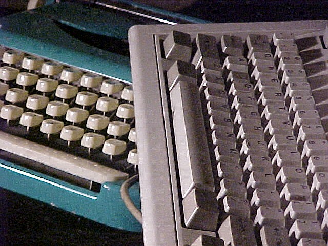
Composition - Actually a very interesting photo. I like the way you compared the old finger buster to the newly improved electic typewriter. The photo is grainy and not the clearest. You know, honestly I think I like it this way as a real throwback to something you'd see in life magazine in the late 60s when "Kodachrome" was becoming really popular. The colors are really good and very reminiscent of the era (although I'm not that old). I personally think it is well done (if your intentions were to make it look old).
Technical - This all has to do with the intentions part. If it was not supposed to be clear, then I think its slightly out of focus. If it was not supposed to be grainy, then I think the ISO was too high and you could have used a lower ISO and more light. DOF is good and the framing is really wonderful.
Overall - I think this is a great throwback photo to days of yore when the electric typewriter was the thing that was going to keep 50,000 secretaries from battling carpal tunnel syndrome. I think this photo is really underrated. Maybe I'm one of the few who understand it? Well done. At least if no one else thinks so, I'll go on the record and say I like it. Good job. - Inspzil |
|
Comments Made During the Challenge  |
|
|
03/30/2003 01:16:25 PM |
|
|
|
03/30/2003 11:58:41 AM |
| Good idea but I think your lighting is too harsh. |
|
|
|
03/28/2003 12:50:38 AM |
| nice idea, photo looks very grainy though |
|
|
|
03/27/2003 04:12:06 PM |
| Nice image and idea. I like it very much! |
|
|
|
03/27/2003 02:43:38 PM |
| I like the teh. comparison. |
|
|
|
03/26/2003 06:12:20 PM |
It did take me a while to "get the connection", but I'm there now. It's a very clear photo, but the computer keyboard seems grainy (as does the body of the manual typewriter), but the keys of the manual typewriter seem either over-sharpened or too much jpeg compression (I can't tell which). Challenge - loosely met, IMO.
5 Swash |
|
|
|
03/26/2003 02:01:39 PM |
| nice idea of the keyboard and type writter nice work |
|
|
|
03/26/2003 12:11:02 PM |
| Grain in image distracts, I would loose the cord |
|
|
|
03/26/2003 08:16:04 AM |
| very grainy... easily fixed... something I would do... just fix the grain. |
|
|
|
03/24/2003 05:48:21 PM |
| Why not have them more in focus. It's a creative idea, though |
|
|
|
03/24/2003 08:35:22 AM |
| I see some really bad compression artifacts. |
|
|
|
03/24/2003 08:32:06 AM |
| Oh be careful on the quality of the picture |
|
|
|
03/24/2003 08:18:06 AM |
| Very original idea and well composed considering the unexciting nature of the objects being photographed. Well done for thinking it up. |
|
Home -
Challenges -
Community -
League -
Photos -
Cameras -
Lenses -
Learn -
Help -
Terms of Use -
Privacy -
Top ^
DPChallenge, and website content and design, Copyright © 2001-2025 Challenging Technologies, LLC.
All digital photo copyrights belong to the photographers and may not be used without permission.
Current Server Time: 03/12/2025 07:53:15 AM EDT.