| Author | Thread |
Comments Made During the Challenge  |
|
|
03/13/2005 07:10:45 AM |
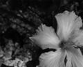
| Even though I can't make out what the subject is, I like this shot very much. |
|
 Photographer found comment helpful. Photographer found comment helpful. |
|
|
03/09/2005 02:59:33 AM |
| A little overexposed and subject of composition a tad dull |
|
|
|
03/08/2005 07:48:37 AM |
|
|
|
03/08/2005 07:46:02 AM |
|
|
|
03/07/2005 09:29:01 PM |
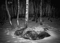
| I really like this photo; but I'm not able to connect it to AA's work. (quibble; that stone on the left edge would normally not matter much, but it is one of half a dozen identifiable objects in the photo, so I find it's placement distracting. |
|
| Photographer found comment helpful. |
|
|
03/07/2005 09:02:31 PM |
| You highlights are very blown out. |
|
|
|
03/07/2005 08:45:06 PM |
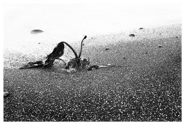
| Good idea and framed properly according to the rule of thirds. This image is more high key than it is Ansel Adams style but that did not bother me. It suffers from what most of my digital images suffer from... It looks both oversharpened and out of focus at the same time when there is a lot of fine detail like in the sand. It is made worse in a demanding challenge like this one. The top of the frame is washed out and makes you wonder more what was missed than it does enhancing the main subject. (Score: 5) |
|
| Photographer found comment helpful. |
|
|
03/07/2005 08:00:38 PM |
| not enough depth to this ... the white in the background detracts from the poor plant |
|
|
|
03/07/2005 12:59:48 PM |
| The color is excellent, but I'm not crazy about the subject. 8 |
|
Home -
Challenges -
Community -
League -
Photos -
Cameras -
Lenses -
Learn -
Help -
Terms of Use -
Privacy -
Top ^
DPChallenge, and website content and design, Copyright © 2001-2025 Challenging Technologies, LLC.
All digital photo copyrights belong to the photographers and may not be used without permission.
Current Server Time: 03/17/2025 09:37:32 AM EDT.