| Author | Thread |
Comments Made During the Challenge  |
|
|
03/20/2005 05:22:45 PM |
| Slightly too much shadow to the left hand side and I would have prefered a focus at the front receeding backwards but a good entry anyhow |
|
 Photographer found comment helpful. Photographer found comment helpful. |
|
|
03/18/2005 08:21:08 AM |
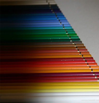
| This is a wonderful idea but I think the execution could have been improved. The lighting is too irregular and the large shadowy areas on the left detract from the regular, patterned appearance. The dof is a little too shallow too. I think you might have zoomed in closer, fewer pencils (or whatever) and brought out more detail and sharpness. Together with more uniform lighting, it could've been a visually arresting photo. As is, it's interesting, but not quite there... |
|
| Photographer found comment helpful. |
|
|
03/17/2005 11:01:42 PM |
| This is a good idea, but unfortunately it is not real sharp and I think an image like this needs to be tack sharp. A different perspective that would eliminate the right hand background would be more interesting. |
|
| Photographer found comment helpful. |
|
|
03/15/2005 11:01:52 PM |
| Nice concept. Lighting and focus could have been better. Good Luck. |
|
| Photographer found comment helpful. |
|
|
03/14/2005 08:34:00 PM |
| I find both the lighting and composition awkward-not sure why it is necessary to include so much of the wall. |
|
| Photographer found comment helpful. |
Home -
Challenges -
Community -
League -
Photos -
Cameras -
Lenses -
Learn -
Help -
Terms of Use -
Privacy -
Top ^
DPChallenge, and website content and design, Copyright © 2001-2025 Challenging Technologies, LLC.
All digital photo copyrights belong to the photographers and may not be used without permission.
Current Server Time: 03/13/2025 09:20:54 AM EDT.