| Author | Thread |
Comments Made During the Challenge  |
|
|
03/22/2005 11:19:22 PM |
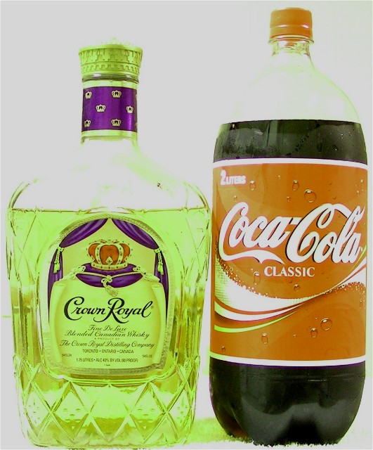
| Looks tilted and it seems like the color is off |
|
|
|
03/22/2005 08:11:25 PM |
| seems a bit overexposed to me. |
|
|
|
03/21/2005 11:42:55 AM |
| colours look really off (on my monitor) - that coke should be red, not orange, I think. And red/green is not a pretty combo. And the composition is a little flat - you have filled the frame, but there is no great variety in shape/height etc to make it interesting. And it seems a little overexposed, as you have lost all of the detail in the necks of the bottles. |
|
|
|
03/20/2005 09:52:26 PM |
| Good idea. Too overexposed for my taste. |
|
|
|
03/20/2005 06:16:43 PM |
| As I am expecting a Coke botle to be blood red I am unsure if this shot is just over exposed or whether the colour has been adapted, I feel the shot is not quite one colour nor the other tho. |
|
|
|
03/20/2005 09:36:19 AM |
|
|
|
03/20/2005 08:43:20 AM |
| colors are really funky. you must mix them strong! The clear parts of the bottles are lost in the background. |
|
|
|
03/20/2005 02:11:19 AM |
| Overly exposed or overuse of brightness/contrast in my opinion. Also, recheck the coloration of the original photo. Every time I've bought Crown Royal, it has never been greenish yellow. I do like the advertising angle for this challenge though. |
|
|
|
03/20/2005 02:02:31 AM |
| I have never heard of that mix before. |
|
|
|
03/19/2005 07:57:20 PM |
| Im thinking the color is WAY off! |
|
|
|
03/19/2005 02:24:42 PM |
|
|
|
03/18/2005 11:06:29 PM |
| Coloring , lighting , somethings a aww |
|
|
|
03/18/2005 04:33:27 PM |
| Looks really Green...but good combination |
|
|
|
03/18/2005 01:52:04 AM |
| Haha, funny shot, but it has a weird green tint to it and seems overexposed. |
|
|
|
03/17/2005 09:13:27 PM |
| The background seems a little blown out... |
|
|
|
03/17/2005 10:31:32 AM |
| good idea but im not sure that cr and coke taste that good together |
|
|
|
03/17/2005 08:19:21 AM |
| overexposed... contrast/colour adjustment would have helped this |
|
|
|
03/17/2005 05:58:05 AM |
| Aside from the poor composition, the lighting is just horrible on this. Sorry for being so harsh, but man, this one just makes my eyes hurt!! |
|
|
|
03/16/2005 08:42:43 PM |
| as far as i remember, colors are way off... good combo though |
|
|
|
03/16/2005 08:30:24 PM |
| Overedited or underexposed? |
|
|
|
03/16/2005 05:19:18 PM |
|
|
|
03/16/2005 03:16:37 PM |
| Everything is washed out with green cast to it. |
|
|
|
03/16/2005 02:57:21 PM |
Crop is too tight, color cast is obvious and image is over-exposed.
Better luck next time... |
|
|
|
03/16/2005 02:52:07 PM |
| i've checked this picture on 4 different computers as i needed to see if the colors were off. The Crown Royal has a green tint to it, and both bottles where ithey're clear are almsot invisible. The Coke lable is too light and almsot on the Orange side. I have you a 4 |
|
|
|
03/16/2005 12:12:14 PM |
| The exposure on this shot hurts my eyes. Does not look very natural color on either bottles. Almost a green/yellow tint. |
|
|
|
03/16/2005 09:55:19 AM |
| crown is gold and the coke isn't red red |
|
|
|
03/16/2005 12:35:35 AM |
| Good idea, but the lighting is really harsh and has a green hue on my monitor. |
|
Home -
Challenges -
Community -
League -
Photos -
Cameras -
Lenses -
Learn -
Help -
Terms of Use -
Privacy -
Top ^
DPChallenge, and website content and design, Copyright © 2001-2025 Challenging Technologies, LLC.
All digital photo copyrights belong to the photographers and may not be used without permission.
Current Server Time: 03/12/2025 11:57:47 PM EDT.