| Author | Thread |
Comments Made During the Challenge  |
|
|
03/27/2005 02:49:40 PM |
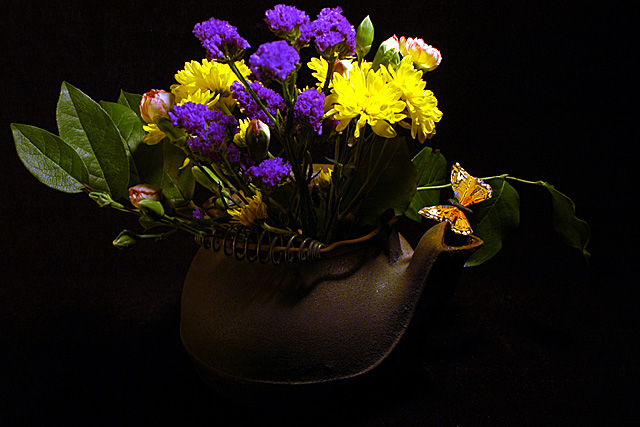
| The pot is a little dark. |
|
 Photographer found comment helpful. Photographer found comment helpful. |
|
|
03/27/2005 02:22:18 AM |
|
| Photographer found comment helpful. |
|
|
03/25/2005 03:59:53 AM |
| Excellent colors, the only drawback is that it seems just a bit too dark. |
|
| Photographer found comment helpful. |
|
|
03/24/2005 10:15:52 PM |
| Nice colors on the flowers, the container looks really interesting but blends in a little too much with the background |
|
| Photographer found comment helpful. |
|
|
03/23/2005 12:27:39 PM |
| Flowers are well lit, but the pot could use a bit more lighting. I don't care for the fake butterfly. |
|
| Photographer found comment helpful. |
|
|
03/23/2005 11:13:53 AM |
| Some flowers seem a bit over satured but it's a nice composition ! |
|
|
|
03/22/2005 10:49:07 PM |
| Classy stock photo, though the pot base is too dark in contrast to the flower top brightness in my opinion. I would also have removed the fake butterfly (if it is indeed a fake). I like the black backdrop. |
|
| Photographer found comment helpful. |
|
|
03/21/2005 09:59:06 PM |
| The colors in the flowers is great but it would be nice to see more detail in the tea pot |
|
| Photographer found comment helpful. |
|
|
03/21/2005 05:36:01 PM |
| I love the teapot and the butterfly. The lighting is good to the extent it is not overpowering. Is it possible to have blown highlights with saturated colors? I think he answer might be yes, and I think this might offer an example; Certainly it looks like there is a loss of detail in both yellow and violet flowers. I know they are beginning to be used together frequently, but I'm not fond of violet with strong yellows. |
|
| Photographer found comment helpful. |
|
|
03/21/2005 07:50:17 AM |
| i think this would look better outside...but its still good! |
|
| Photographer found comment helpful. |
Home -
Challenges -
Community -
League -
Photos -
Cameras -
Lenses -
Learn -
Help -
Terms of Use -
Privacy -
Top ^
DPChallenge, and website content and design, Copyright © 2001-2025 Challenging Technologies, LLC.
All digital photo copyrights belong to the photographers and may not be used without permission.
Current Server Time: 04/25/2025 08:56:18 PM EDT.