| Author | Thread |
Comments Made During the Challenge  |
|
|
03/27/2005 01:47:25 PM |
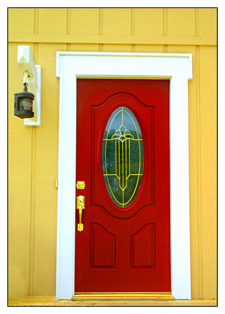
| Would have been better if you were straight-on from the door so that both the door frame and the horizontal board above the door were parallel to the border of the frame |
|
|
|
03/27/2005 08:24:18 AM |
| Eye catching in any home improvement magazine...nice! |
|
 Photographer found comment helpful. Photographer found comment helpful. |
|
|
03/26/2005 10:34:27 PM |
| angle seems off just a bit...bottom is fine but top it tilted...would have moved to a straight-on position..colors are really nice though |
|
| Photographer found comment helpful. |
|
|
03/26/2005 02:26:39 AM |
|
|
|
03/24/2005 06:48:52 AM |
| Very attractive in thumbnail due to the bright colours which is good for a stock pic. |
|
| Photographer found comment helpful. |
|
|
03/23/2005 03:00:37 PM |
| Strong red of the door but I think the rest and its crookedness let it down - sorry |
|
|
|
03/23/2005 01:57:43 PM |
| love the contrasting colors... looking from the bottom is appears to be rotated correctly but when you move your eyes upward it seems a little cockeyed? |
|
|
|
03/22/2005 06:07:49 AM |
| I like the rich colors and strong lines in this picture - but it doesn't seem like the strongest example of stock photography. From my surveying of several books of stock photography, I never saw this sort of thing. Lovely picture, just a dubious connection to the challenge in my mind. |
|
|
|
03/21/2005 09:17:15 PM |
| I love the colors and textures. It's a simple and compelling photo, but its elegance quickly reveals its several subtle flaws.The brass fixtures look just a tad out of focus and the rest of the photo looks a tad unsharp. Also it's rotated about a degree or so clockwise. |
|
|
|
03/21/2005 01:57:07 AM |
| Very nice colors...but you should havestraightened it out a bit. |
|
Home -
Challenges -
Community -
League -
Photos -
Cameras -
Lenses -
Learn -
Help -
Terms of Use -
Privacy -
Top ^
DPChallenge, and website content and design, Copyright © 2001-2025 Challenging Technologies, LLC.
All digital photo copyrights belong to the photographers and may not be used without permission.
Current Server Time: 03/12/2025 11:15:40 PM EDT.